Responsiveness of the 2024 Congressional Districts

The 2024 Congressional elections will not adequately respond to the will of the people. To make this determination, we compared the current congressional maps to two nationwide collection of non-partisan alternative district maps. The first collection of maps did not account for partisanship, whereas the second selected more responsive plans.

Overall, we found that if one would take the idea of responsive maps seriously, there could be 37 to 42 more competitive House seats than are in the current map.

Our findings were featured in a press release from Congressman Wiley Nickel.

We provide details of our findings, that include how we determine responsiveness, the nationwide lack of responsiveness, and the state-by-state differences in responsive districts between the current map and the collections of maps.

Evaluating the Enacted Georgria Congressional Redistricting Plan

We analyze the 2022 enacted Georgia congressional plan. We compare this districting plan with an ensemble generated from non-partisan redistricting policies. We find that (i) the districts are atypically polarized which leads to highly non-responsive elections (typically electing 5 Democratic and 9 Republican representatives), and that (ii) Democrats have been packed in the urban Atlanta area of the state and cracked from the North-Eastern part of the state, in both cases reducing their overall voting power.

The details of our findings are available here.

The Geopolitical Landscape of the North Carolina General Assembly

We have investigated two possible policies for the current redistricting cycle in North Carolina.  Both policies respect the county cluster rule, respect one-person-one-vote, and prioritize compact districting plans.  One of the policies preserves municipalities when redistricting and the other does not consider municipal preservation.  This is in response to the North Carolina Joint Redistricting Committee’s criteria in which they state they “may” consider.

We use these policies to generate two probability distributions (i.e. we quantify preferences between redistricting plans), and we reveal the typical partisan behavior of non-partisan maps drawn according to these policies.

We outline our methods in this document.

We then reveal the expected partisan behavior of the State House and State Senate under a variety of historic elections.

The expected behavior may be compared with the enacted and proposed plans.

We have also released the underlying data used to construct our figures in the above document.

Greg Herschlag and Jonathan Mattingly

North Carolina’s 2020 County Clusters for the General Assembly

As discussed in our previous post, county clusters are used in the North Carolina General Assembly districts to reduce splitting counties. With the release of the 2020 census data, we can now establish all possible county clusters.

We report our findings in a document written with Christopher Cooper (Western Carolina University), Blake Esselstyn (FrontWater LLC and Mapfigure Consulting), and Rebecca Tippett (Carolina Demography, UNC at Chapel Hill).

The document is linked HERE.

To summarize, we find that 36 of 50 state Senate districts will reside county clusters that are now completely determined.  The remaining districts reside in four regions of the state, each with two possible choices of county clusters.  When a county cluster only contains a single district, the district is the cluster.  In the Senate, ten of the 50 districts are determined via clustering.

In the state House, 107 of 120 districts will reside in county clusters that are completely determined.  The remaining districts reside in three regions of the state, each with two possible choices of county clusters.  Eleven of the 120 districts are determined via clustering.

We have also examined incumbency within the new clusters.  Unless incumbents change address, we find that 4 Senate districts must contain two incumbents (i.e. 4 districts will “double bunk” incumbents).  We also find that 5 House districts must contain two incumbents.

We stress that the county clustering process adds a constraint to the redistricting process.  Largely, the county clusters do not determine districts and there is still room for the legislature to draw either fair or gerrymandered maps.

Gregory Herschlag
Jonathan Mattingly

A slide deck on ensemble analysis, indices and county clusters

With the upcoming redistricting cycle, there are a number of questions about how ensembles can, will, and should be used to audit and restrict gerrymandering.

We have prepared a slide deck illuminating how the ensembles have been used to legally challenge plans during the last redistricting cycle.  We have also examined some of the new indices that are being put forward as measures of gerrymandering.  Under a certain set of votes, it is possible to “game” these indices, in the sense that plans can be typical of an ensemble according to multiple indices while still being gerrymanders.

Finally, for the North Carolina general assembly, we demonstrate the fragility and possible choices when it comes to county clustering.

The slides are available here.

Multi-Scale Merge-Split Algorithm

We have recently posted a pre-print of a Multi-Scale Merge-Split sampling algorithm.  The work’s central contribution is to provide a multi-scale representation of the state space which can be used to efficiently sample redistricting plans containing both fine and coarse-scale details.  Because of the coarse-graining, this algorithm promises fast scaling on problems with fine-scale graphs.  It also is capable of naturally preserving nested communities of interest (such as precincts made up of census blocks, and counties made up of precincts) without creating prohibitive energetic barriers which slow mixing. This work builds on our Merge-Split algorithm, which, in turn, builds on the ReCom algorithm.

Evolution of the state space
Convergence properties

The Animated Firewall

When discussing gerrymandering, there is an intuitive drive to discuss how many seats were won by a given party, and how egregious this result may be.  The measure of egregiousness may come from an assumed ideal of proportionality or symmetry, or may come from a comparison with an ensemble of alternative plans.

But as we have shown, the number of elected party officials in a gerrymandered plan may be entirely typical of the ensemble; it may, for example, only be when a party is in danger of losing the majority of seats that a plan becomes a typical.  In this previous post, we have made efforts to visualize how changes in the Democratic or Republican statewide vote fraction change the number of elected Democrats and Republicans in both the ensemble and an enacted plan.  In this post, we create an animation of this effect.

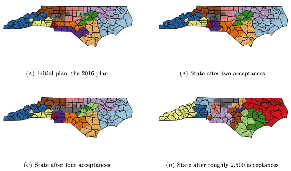
In North Carolina, state house Republican Representative David R. Lewis famously stated that the 2016 North Carolina congressional maps were drawn “to give a partisan advantage to 10 Republicans and three Democrats because I do not believe it’s possible to draw a map with 11 Republicans and two Democrats.”  We ask how robust this effect is by considering the 2016 United States Congressional voting data in North Carolina and then using the uniform swing hypothesis to vary the statewide Democratic vote percentage from 42.5% to 57.5%.   We render an animation that demonstrates how the number of elected Democrats changes in the ensemble and the 2016 enacted plan with respect to the statewide Democratic vote fraction.

When the statewide Democratic vote is between 42.5% and 52.25%, the enacted plan consistently elects 3 of 13 Democrats.   From 47% to 53.25%, the enacted plan is an extreme outlier with respect to the ensemble.    Even as the Democrats pick up a fourth seat in the enacted plan at 52.37%, nearly all plans in the ensemble elect 5 or more Democrats.  In short, under this election structure and swing assumptions, the Democrats would need nearly 53% of the statewide vote in order to gain a number of seats that are even some what typical of the ensemble of plans.

We repeat this animation in the Wisconsin general assembly, examining the 2012 United States Senate vote in Wisconsin and using the uniform swing hypothesis to vary the Democratic statewide vote percentage from 44% to 56%.

The firewall is now animated: Again, when the statewide Democratic vote is less than 50%,  the enacted plan and the ensemble lead to a Republican majority and the enacted plan is typical of the ensemble; the statewide Democratic vote rises to 51% , the enacted plan becomes atypical of the ensemble, however both the ensemble and the enacted plan still yield a Republican majority; as the Democratic vote fraction continues to increase, the enacted plan becomes more atypical yielding far fewer Democrats than is expected by the ensemble.   In a large range the ensemble predicts the that the Democrats should expect to receive a majority, however they do not under the enacted plan;  at the higher end, the Democrats begin to expect a supermajority from the ensemble, but they do not achieve this in the enacted plan.

Gregory Herschlag
Jonathan Mattingly