The 2024 Congressional elections will not adequately respond to the will of the people. To make this determination, we compared the current congressional maps to two nationwide collection of non-partisan alternative district maps. The first collection of maps did not account for partisanship, whereas the second selected more responsive plans.
Overall, we found that if one would take the idea of responsive maps seriously, there could be 37 to 42 more competitive House seats than are in the current map.
Our findings were featured in a press release from Congressman Wiley Nickel.
We provide details of our findings, that include how we determine responsiveness, the nationwide lack of responsiveness, and the state-by-state differences in responsive districts between the current map and the collections of maps.
Note: The original post analyzed the congressional plan proposed in Senate Bill 756; we have updated the analysis to include the plan proposed in Senate Bill 757.
We have completed an initial analysis of the redistricting plans recently proposed by the NC Legislature on Wednesday, October 18. The legislature has proposed changing the maps used to elect the North Carolina congressional delegation to the US House of Representatives and the maps used to elect the NC House and the NC Senate members of the NC Legislature.
We use the same methodology as described in our report here. The nonpartisan ensembles of maps used in the below analysis are the primary ensembles previously presented to the court in Harper v Hall/Moore in 2021.
A first indication of gerrymandering in the new Congressional maps comes from comparing it with the remedial map from 2022. We do this by using the votes from the 2022 US Senate race which has a statewide partisan vote share of 48.35% preferring the Democrats. Under these votes, both proposed maps (from SB756 and SB757) would elect 11 Republicans and 3 Democrats to the US House of Representatives while the remedial map it replaces would have elected 7 Republicans and 7 Democrats.
One of the basic principles of a functioning democracy is that when the electorate changes its political opinion this change should be reflected in the elections outcome. The proposed congressional maps are both highly non-responsive to changes in the opinion of the electorate. We find that over a number of recent historical elections and other possible political environments, the newly proposed congressional map from SB756 reliably elected 11 Republicans and 3 Democrats despite the elections having wildly different votes. Similarly, the map proposed in SB757 reliably elected between 10 and 11 Republicans and between 3 and 4 Democrats. Furthermore, even under dramatic voting swings, the newly proposed congressional plans consistently elect more Republicans than would be expected from a non-partisan process.
To see this, we examine voting patterns between 45% and 55% Democratic statewide vote shares based on the 2022 US Senate election and the 2020 Presidential election and reproduce the movies described here. We see that the newly proposed maps are significantly less responsive to the changing will of the people as expressed in their votes than the 2022 remedial map they would replace. Over all of the historical elections considered in the plot below, the proposed map from SB756 always elects 11 Republicans and 3 Democrats and the proposed map from SB757 elects 10 or 11 Republicans and 3 or 4 Democrats. In contrast, the remedial map that is likely to be replaced and which was used in the 2022 elections varies from electing 9 Republicans and 5 Democrats to electing 7 Republicans and 7 Democrats.
Furthermore, we observe that the newly proposed plans are even less responsive than the originally overturned plan from 2021 and lean more Republican than either the overturned plan drawn by the legislature in 2021 and the remedial plan that will likely be replaced from 2022. The collection of histograms over historic elections displays the rigidity of both plans. It also displays how the plan from SB756 leads to an extra Republican seat when comparing to the overturned 2021 map. The difference between the overturned 2021 map and the plan proposed in SB757 is not evident in the collection of histograms, however, the difference can be observed in both the videos and also in the rank-ordered districts that we present at the end of this post and which are explained in this past post. The key take away is that there are three Democrats residing in packed districts that will reliably vote Democratic, whereas the 4th most Democratic seat is even less reliably Democratic in the newly proposed plan from SB757 than it was under the overturned 2021 plan.
The two videos below show how the remedial map that was used in the 2022 election responds to elections swinging from preferring Republicans to elections preferring Democrats while the newly proposed maps fail to change the seats elected as the election votes swing from 45% to 53% Democratic vote share.
We display the election results in the ensemble and the two most recently enacted congressional maps in North Carolina along with the newly proposed maps. We see the rigidity in both the 2021 and newly proposed 2023 plans over a wide range of historic voting patterns and the extreme Republican bias that they show relative to the ensemble of plans.
In addition to the analysis in the Congressional maps, we also present an analysis of the state house and state senate maps. We reproduce the animated effect using the Presidential 2020 results. In both chambers, we find that the proposed plans are even more extreme than the originally enacted 2021 maps. Additionally, we find that new proposed maps are less responsive to changes in the votes than the remedial maps used in the 2022 elections.
Both the Senate and House maps under-elect Democrats as one moves to more balanced elections with Republican statewide vote fractions near 50%. This has important implications for the preservation of the super-majority in the chamber. Under the newly proposed Senate maps, the Republicans may reasonably expect to obtain a super majority, even when the statewide Democratic vote share is over 50%.
The figures below show the number of Democrats elected to the NC Senate and House using a number of different historical elections which have a wide range of state-wide Democratic vote share. As one moves into the elections the ensemble shows that the Republicans would typically fail to obtain a super majority, the proposed map significantly under-elects Democrats.
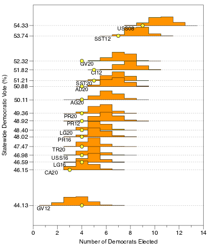
In the Senate, using the AG16, the AG20, the GV16, the USS20, the CL20, and the PR20 elections, Democrats would typically break the supermajority using the maps in the ensemble or using the remedial map from 2022. Yet the newly proposed map would preserve the Republican super-majority. In these elections, the statewide Democratic vote share ranges from 48.9% to 50.2%.
In the House, using CL20 and USS20 election data, the Democrats would typically break the supermajority using the maps in the ensemble or using the remedial map from 2022. Yet the newly proposed map preserves the super-majority. In the more democratic-leaning elections the ensemble and the remedial map from 2022 would typically give control of the chamber to the Democrats but the newly proposed map leaves the Republicans with a sizable majority.
We display the election results in the ensemble and the two most recently enacted Senate maps in North Carolina along with the newly proposed map.We display the election results in the ensemble and the two most recently enacted House maps in North Carolina along with the newly proposed map.
As stated above, we conclude by returning to the congressional maps and compare the 4th most Democratic seat between the plan from SB757 and the overturned plan from 2021. We observe that under both the Presidential 2020 votes and the US Senate 2022 votes, the 4th most Democratic seat is more Republican under the plan from SB757 than it is under the overturned 2021 plan. We have also repeated the analysis for the votes under the 2020 Attorney General election and the 2016 Presidential election and find the same conclusion: Under the 2020 Attorney General election, the fourth most Democratic seat would yield a 53.6% of the vote going to the Democratic candidate under the overturned results, while giving a narrower margin of 52.8% to the Democratic candidate under the plan proposed in SB757. Similarly, under the 2016 Presidential election, the fourth most Democratic seat would yield a 53.0% of the vote going to the Democratic candidate under the overturned results, while giving only a narrower margin of 52.4% to the Democratic candidate under the plan proposed in SB757.
We generate the ranked-order district statistics for the ensemble along with the 4 plans under the votes from the 2022 US Senate election . Both the plan from SB757 and the overturned plan from 2021 elect the three Democrats, however the 4th most Democratic seat (labelled “4th D”) is more Republican leaning in the newly proposed map than in the overturned map.We generate the ranked-order district statistics for the ensemble along with the 4 plans under the votes from the 2020 Presidential election . Both the plan from SB757 and the overturned plan from 2021 elect the four Democrats, however the 4th most Democratic seat (labelled “4th D”) is more Republican leaning in the newly proposed map than in the overturned map.
Jonathan Mattingly
Greg Herschlag
The data used in this analysis can be found here. In addition to this, we have imputed the 2022 voting data down to the census block level and report those numbers here.
Jonas Eichenlaub, 2022, Bowdoin College
Faculty Mentors: Jack O’Brien (Bowdoin), Gregory Herschlag (Duke), Jonathan Mattingly (Duke)
[What follows is a short summary of work done as a summer research project in 2021. The longer report can be found here.]
Gerrymandering is a pervasive issue in American politics and over the last decade mathematicians have made notable contributions towards its detection and avoidance. One focus of these efforts has been using computers to generate an ensemble of potential legislative maps and then comparing a real map against this distribution of maps. Vote counts from recent elections can then be plugged into both the real and simulated maps to understand whether the number of districts a given party wins under the real map is statistically likely under the distribution of generated maps. In other words, if one party wins far more seats in the real map than the mean number of seats they win in the simulations, it is likely the real map is the result of gerrymandering. Since gerrymandering is often hard to precisely define, it is easy for policymakers to circumvent any one metric of how gerrymandered a district is; the strength of this technique is that it does not rely on a single metric, instead wholistically comparing the real map with the ensemble of possible maps.
A prevalent way of creating such an ensemble of simulated maps is with a recombination (or ReCom) algorithm, which involves encoding a state as a graph with voting precincts as nodes. The graph is partitioned into districts according to constraints and preferences within the algorithm to make sure that the edges that are cut to create connected components (partitions or districts) with roughly equal populations, minimal municipality splitting, and whatever other legal criteria legislative maps must meet. By cutting different edges of the original graph, different maps are formed, which collectively create an ensemble of possible maps. Duke Professors Jonathan Mattingly and Gregory Herschlag have proposed formalizing such an approach by placing a recombination algorithm into a Metropolis-Hastings Markov Chain, where the proposal of a new map is separated from the acceptance of that proposal into the ensemble. Instead of making decisions about how maps are added to the ensemble based on the structure of the algorithm, Mattingly and Herschlag’s work applies the existing mathematical theory on Metropolis-Hastings chains to justify their approach. Each map represents a stage in the chain, and new maps are proposed with the merge-split technique described above. Maps are then added to the chain based on an acceptance probability that quantifies how well the proposed map fits within the legal criteria, which is designed to be changeable to meet the specific policy parameters of different states. By making the choices within the algorithm explicit, Mattingly and Herschlag offer an approach to detecting gerrymandering that is more defensible when used as evidence in legal challenges to gerrymandered maps.
Part of their contribution is to sample maps from possible partitions of a state rather than from possible spanning trees of the graph of the state, since each partition of a state can be formed by a different number of spanning tree configurations. My research this summer focused on determining whether sampling from partitions generates different ensembles of maps than that from the spanning tree method; more specifically, I investigated whether algorithms that sample from the space of spanning trees are less likely to generate maps that draw district lines along the border between areas with high and low population density (i.e., along the borders of cities). I ran a version of Prof. Mattingly and Herschlag’s algorithm that sampled from the partition space and a version that sampled from the spanning tree space on a variety of “test states” that I constructed. I represented each test state simply as a lattice graph, with a few nodes on the lattice replaced with smaller, denser lattice graphs representing cities. The “city” nodes along the edge of the denser lattice all had edges connecting to the same neighboring “noncity” node, which meant that drawing a district line between these two areas required cutting far more edges than drawing it between other sections of the graph (which normally would only require one cut); the motivating idea behind my investigation was that the spanning tree algorithm views this as costlier and is less likely to select maps with district lines the run between the city and noncity nodes. I varied the placement, size, and number of these “cities” to gain insight into how often each of the two versions of the algorithm cut the edges between the city and noncity nodes.
Notably, I created a test city that was a 9×9 grid, with the center node replaced by a 4×4 city. I ran both versions of the algorithm on this test state with 3, 4, 6, 8, and 12 districts. For each of the two ensembles, I then count the number of times that edges of the graph that connect a node in a city to another node fell on a legislative district border across all maps in that ensemble; this number is then divided by a tally of the total number of edges that fell on district borders. This statistic is the fraction of edges that cross district borders that go from city to anywhere that looks at the proportion of edges that are cut which connect one city node to either a noncity node or another city node. The difference between the results of this statistic from running the two algorithms on each scenario is reported in the table below, with positive results indicating it is higher under the gamma equals one algorithm.
Number of Districts
3
4
6
8
12
Ideal District Pop
32000
24000
16000
12000
8000
DeltaCity-to-anywhere
0.13672
0.28727
0.06528
0.06211
0.02969
I found that the algorithm that samples uniformly from spanning trees is less likely to make districts that have edges along the border of cities, but only under certain situations. The two main factors that determine whether such bias appears in an ensemble are the district population size and the city population size. When the city population fits perfectly within a single or multiple districts, as is the case when there are 4 districts in the above test state, the spanning tree algorithm is significantly more likely to create maps that do not break up cities compared to the partition-space algorithm; hence, a hidden bias in the original merge-split approach is evident. However, if the city population does not fit evenly into one or more districts, as is the case when there are 6, 8, or 12 districts, both algorithms are forced to break up the city and there is not a notable difference between the ensembles they generate. These results reinforce why it is important to use Mattingly and Herschlag’s approach, as their formalized algorithm does not automatically keep municipalities within the same district in a hidden and uncontrollable manner. Instead, it allows for policymakers to explicitly decide how much they want to preserve cities by incorporating this preference into the acceptance probability. Given that the redistricting process from the 2020 Census is currently underway, this insight could find application in the upcoming legal challenges to the inevitably gerrymandered maps that politicians propose.
We analyze the 2022 enacted Georgia congressional plan. We compare this districting plan with an ensemble generated from non-partisan redistricting policies. We find that (i) the districts are atypically polarized which leads to highly non-responsive elections (typically electing 5 Democratic and 9 Republican representatives), and that (ii) Democrats have been packed in the urban Atlanta area of the state and cracked from the North-Eastern part of the state, in both cases reducing their overall voting power.
We analyze the enacted North Carolina congressional plan (CST-13), the enacted North Carolina House General Assembly plan (SL 2021-175), and the currently proposed North Carolina Senate General Assembly plan (SST-13).
We compare these three districting plans with the ensembles we generated from non-partisan redistricting policies. See here for the congressional analysis and here for the general assembly analysis; these documents contain information on the non-partisan criteria considered along with the resulting ensemble of maps.
A comparison of the enacted CST-13 congressional map with a non-partisan ensemble of maps under a range of historic elections.
As an example, we look at the number of elected Democrats that would have occurred under a range of historic elections. Under each election, we compare the ensemble of non-partisan maps with the enacted map. The enacted congressional plan elects 4 Democratic representatives under a large range of statewide Democratic vote fractions. This level of non-responsiveness is not seen in the ensemble of plans.
We have performed an analysis of the geopolitical landscape of the North Carolina State using the 2020 Census data. We provide a
summary plot derived from an explicit distribution on redistricting
plans. The distribution favors plans with compact districts which keep counties intact.
As the character of the votes considered swing from more Republican to more Democrat, we see a gradual increase in the number of seats won by the democratic party. This responsiveness to the changing opinion of the electorate is consistent with what has been observed when maps are drawn without partisan considerations; either by sampling or by bipartisan committees.
We have investigated two possible policies for the current redistricting cycle in North Carolina. Both policies respect the county cluster rule, respect one-person-one-vote, and prioritize compact districting plans. One of the policies preserves municipalities when redistricting and the other does not consider municipal preservation. This is in response to the North Carolina Joint Redistricting Committee’s criteria in which they state they “may” consider.
We use these policies to generate two probability distributions (i.e. we quantify preferences between redistricting plans), and we reveal the typical partisan behavior of non-partisan maps drawn according to these policies.
As discussed in our previous post, county clusters are used in the North Carolina General Assembly districts to reduce splitting counties. With the release of the 2020 census data, we can now establish all possible county clusters.
We report our findings in a document written with Christopher Cooper (Western Carolina University), Blake Esselstyn (FrontWater LLC and Mapfigure Consulting), and Rebecca Tippett (Carolina Demography, UNC at Chapel Hill).
To summarize, we find that 36 of 50 state Senate districts will reside county clusters that are now completely determined. The remaining districts reside in four regions of the state, each with two possible choices of county clusters. When a county cluster only contains a single district, the district is the cluster. In the Senate, ten of the 50 districts are determined via clustering.
In the state House, 107 of 120 districts will reside in county clusters that are completely determined. The remaining districts reside in three regions of the state, each with two possible choices of county clusters. Eleven of the 120 districts are determined via clustering.
We have also examined incumbency within the new clusters. Unless incumbents change address, we find that 4 Senate districts must contain two incumbents (i.e. 4 districts will “double bunk” incumbents). We also find that 5 House districts must contain two incumbents.
We stress that the county clustering process adds a constraint to the redistricting process. Largely, the county clusters do not determine districts and there is still room for the legislature to draw either fair or gerrymandered maps.
The decennial redistricting cycle is an important moment in our democracy. Drawing districts can have a dramatic effect on how our elections are interpreted and the people’s ability to hold their representatives accountable.
Today, roughly 1 month before the 2020 Census is release, we and 3 other North Carolinians are releasing an analysis around the coming 2020 Census and how it will affect the county clusters used to draw the legislative districts for the N.C. State Legislature.
For more information on what county clusters are and how they affect districting, see here and here.
We do not intend our analysis to have much predictive value. A main takeaway from the study is that the clusters are very sensitive to fluctuations in the county populations; the official county populations will not be released until mid-august. Nonetheless, it is clear that the current county clusters will change in the coming redistricting cycle and that there will likely be multiple options for which clusters we implement. We hope that our note will inform public discussion around this process.
Quoting from the study, the main takeaways are:
We expect that county clusters based on the 2020 Census population will be very different from those used in the last decade.
There is significant variation in the county clusters across the different population estimates for 2020. Hence, caution should be exercised when drawing conclusions from the specifics of the maps we have included. We note the few clusters which seem to be stable across the population estimates.
Using the 2010 population figures we found 2 possible clusterings for the N.C. Senate. The number of clusterings for the 2020 population estimates ranged from 12 to 33.
Using the 2010 population figures we found 4 possible clusterings for the N.C. House. The number of clusterings for the 2020 population estimates ranged from 2 to 16.
Some members of the study team will be releasing further commentary on what we have seen here during the coming month. We expect to release a similar discussion once the official 2020 Census population figures are released. Please watch this site and the following venues for further commentary: