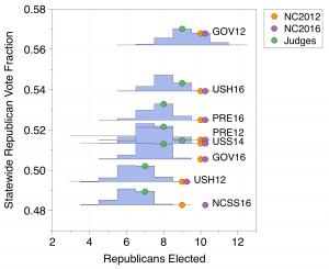
One recurring theme we see is that the results in enacted maps are “baked in.” That is to say that over a wide range of elections changes in the votes do not lead to changes in the partisan make up of the representatives elected. This effect was very pronounced in the N.C. Congressional maps used in 2012 and 2016 . The enacted maps (NC 2012 & NC 2016) produce the same result over a large range of elections. These elections have varying statewide vote fractions; the ensemble shows that the number of elected Democrats change as the elections change, whereas the enacted plans nearly always give the same result.
Here we have shown a number of historical elections and arranged them on the plot from most Democratic to most Republican. We see that as the Republican vote fraction increases the blue histograms show that the typical number of seats elected by our ensemble of 24,000 or so maps shifts towards the Republican direction. The number of Republican seats elected by the Beyond Gerrymandering Judge’s map responds to the shifting public opinion by shifting the number of Republicans elected. The Enacted plans from 2012 and 2016 don’t change over a wide range. In the enacted plan, the loss of support for a party does not result in the loss of seats. In the ensemble and the judges plan, the loss of support for a party causes that party to lose seats.
This effect can be understood in the box-plot graphs of the ordered marginal plots.
The large jump in the plot, which leads to a range of election results for which the partisan outcomes don’t change, was has been referred to as the “Signature of Gerrymandering.”
One of the strengths of sampling the space of redistricting plans is that it makes no assumptions about the relationship between the statewide votes cast and the seats won. The collection of plans do not consider proportionality between seats and votes or symmetry in electoral outcomes.
These methods reveal the expected election results under our election system; they assume only the redistricting criteria (usually non-partisan). The sampled maps provide a null hypothesis. Any enacted map can be compared to this null hypothesis to understand the extent of any possible gerrymandering.
The collection of maps, and the expected election outcome they reveal, automatically includes the effect of cities, the distribution of voters and the shape of the region in a simple and principled way. We have looked at North Carolina, Wisconsin and more informally Maryland and Pennsylvania. We have never seen proportionality between the votes and typical seats given by an ensemble.
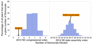
For example, consider the election of the US House of representatives for North Carolina and the election of the General Assembly of delegates for Wisconsin. In the first, we compare the 2012 enacted plan against the ensemble using the 2012 Congressional votes; in the second, we compare the 2011 enacted Wisconsin plan against the ensemble using the 2014 General Assembly votes.
NC House 2012
Vote
Seats
Democratic
50.65%
4 (31%)
Republican
48.80%
9 (69%)
Votes and Seats for N.C. House in 2012 using 2012 enacted map.
Wisconsin 2014
Votes
Seats
Democratic
51.28%
36 (36%)
Republican
48.72%
63 (64%)
Votes and Seats for Wisconsin General Assembly using votes and enacted plan from 2014.
Clearly neither seat outcome of the enacted plan would be call proportional representation. However, the large ensemble of non-partisan maps reveals that the results in Wisconsin are, in fact, typical for this set of votes whereas the North Carolina outcome is not.
Although the WI enacted plan is representative for this particular set of votes, when the Democratic vote fraction drops below 50%, the enacted plan acts as an extreme outlier producing highly atypical results. (This effect is well understood: See Firewall and The Signature of Gerrymandering.) This effect is shown below.
Enacted plan is shown with read dot. Histogram of results from ensemble using different sets of votes. WSA= WI State Assemble, GOV= Governor , SOS=Secretary of State, USS= US Senate, PRE=President). Proportionality shown with dashed line.
Notice that the trend shown by the ensemble histograms in blue do not follow the vote-seat proportionality line marked on the plot. However the Enacted map is still shown to be an outlier as the vote fraction drops below 50%. It shows a “baked in” result which is do not move as the people’s will expressed in their votes changes.
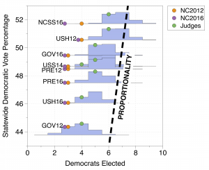
This “baked in” election outcome is even more pronounced in N.C. where the enacted maps (NC 2012 & NC 2016) produce the same result over a large range of elections. These elections have varying statewide vote fractions; the ensemble shows that the number of elected Democrats change as the elections change, whereas the enacted plans nearly always give the same result.
Collection of histograms plotted in blue for various elections (PRE=president, USH= US House, GOV=Governor). Three plans are show: 2012 Enacted (NC2012), 2016 Enacted (NC2016) and the Panel from the Beyond Gerrymandering Project (Judges) . Proportionality shown with dashed line.
Again the proportionally line on the plot does not track the shift in the blue histograms produced by the ensembles as the election used varies. The ensemble reveals the natural baseline without assuming proportionality.
When discussing gerrymandering, there is an intuitive drive to discuss how many seats were won by a given party, and how egregious this result may be. The measure of egregiousness may come from an assumed ideal of proportionality or symmetry, or may come from a comparison with an ensemble of alternative plans.
But as we have shown, the number of elected party officials in a gerrymandered plan may be entirely typical of the ensemble; it may, for example, only be when a party is in danger of losing the majority of seats that a plan becomes a typical. In this previous post, we have made efforts to visualize how changes in the Democratic or Republican statewide vote fraction change the number of elected Democrats and Republicans in both the ensemble and an enacted plan. In this post, we create an animation of this effect.
In North Carolina, state house Republican Representative David R. Lewis famously stated that the 2016 North Carolina congressional maps were drawn “to give a partisan advantage to 10 Republicans and three Democrats because I do not believe it’s possible to draw a map with 11 Republicans and two Democrats.” We ask how robust this effect is by considering the 2016 United States Congressional voting data in North Carolina and then using the uniform swing hypothesis to vary the statewide Democratic vote percentage from 42.5% to 57.5%. We render an animation that demonstrates how the number of elected Democrats changes in the ensemble and the 2016 enacted plan with respect to the statewide Democratic vote fraction.
When the statewide Democratic vote is between 42.5% and 52.25%, the enacted plan consistently elects 3 of 13 Democrats. From 47% to 53.25%, the enacted plan is an extreme outlier with respect to the ensemble. Even as the Democrats pick up a fourth seat in the enacted plan at 52.37%, nearly all plans in the ensemble elect 5 or more Democrats. In short, under this election structure and swing assumptions, the Democrats would need nearly 53% of the statewide vote in order to gain a number of seats that are even some what typical of the ensemble of plans.
We repeat this animation in the Wisconsin general assembly, examining the 2012 United States Senate vote in Wisconsin and using the uniform swing hypothesis to vary the Democratic statewide vote percentage from 44% to 56%.
The firewall is now animated: Again, when the statewide Democratic vote is less than 50%, the enacted plan and the ensemble lead to a Republican majority and the enacted plan is typical of the ensemble; the statewide Democratic vote rises to 51% , the enacted plan becomes atypical of the ensemble, however both the ensemble and the enacted plan still yield a Republican majority; as the Democratic vote fraction continues to increase, the enacted plan becomes more atypical yielding far fewer Democrats than is expected by the ensemble. In a large range the ensemble predicts the that the Democrats should expect to receive a majority, however they do not under the enacted plan; at the higher end, the Democrats begin to expect a supermajority from the ensemble, but they do not achieve this in the enacted plan.