It is tempting to assume that gerrymadnering requires the presence of oddly shaped districts. After all, the term gerrymandering derives from the salamander-shaped maps produced by Massachusetts’s 1812 Governor Elbridge Gerry, and pictures of that meandering district are practically required in any discussion of gerrymandering.
The story goes that the irregularly shaped boundary attempts to include or exclude particular voters from the district. Although irregular boundaries might well cause one to suspect gerrymandering, it is quite possible for a gerrymandered map to have quite regular districts. Oddly shaped districts, such as like North Carolina’s 12th congressional district and Pennsylvania’s 7th congressional district, make provocative tee-shirts and posters, but they are only a symptom and not the point of Gerrymandering .
An Example
As illustrative example is given by the districting plans used in the North Carolina 2012 and 2016 US congressional elections, denoted NC2012 and NC2016 in what follows.

The NC2012 Congressional plan has many more irregular shaped districts than the NC2016 Congressional Plan.

We then compare these two maps with the map drawn in the bipartisan redistricting commission of retired judges from the Beyond Gerrymandering Project, denoted “Judges” in what follows.

We ask the simple question:
Which maps is not like the others ?
Visually, the Judges and the NC2016 Congressional plans have a lot in common and the NC2012 Congressional plan seems the “odd map out.” The NC2012 Congressional plan has many long, irregularly shaped districts. The NC2016 and the Judges Congressional plans, both have relatively spatially compact districts compared to the NC2012 Congressional plan. Thus, requiring compact districts only addresses a symptom of gerrymandering.
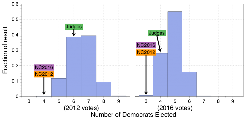
However, if we compare the properties of the three plans, we see that the NC2012 and NC2016 Congressional plans behave quite similarly while the Judges Congressional plan behaves quite differently. If we use the votes from the actual 2012 and 2016 elections we see that the NC2012 and NC2016 Congressional plans produce 4 Democratic seats out of 13 while the Judges Congressional plan produces 6. Similarly, if we use the votes from the actual 2012 and 2016 elections we see that the NC2012 and NC2016 Congressional plans produce 3 Democratic seats out of 13 while the Judges Congressional plan produces 4.
When we use an ensemble of just over 24,000 generated maps we see that Judges plan produces typical results with these tow vote sets while the NC2012 and NC2016 Congressional plans are statistical outliers.

Even more tellingly, when the box-plots of the ordered marginals are compared, the structure of the NC2012 and NC2016 Congressional plans have the same structure with a characteristic jump between the 10th and 11th most democratic districts.

We have referred to this jump as the signature of Gerrymandering. As describe in a separate posting, these box plots can help identify “cracking and packing” of voters. We see that both the NC2012 and NC2016 Congressional plans have exceptionally many Democrats (packing) in the three most Democratic districts while exceptionally few Democrats in the next the most Democratic districts (cracking). The Judges plan does not share this structure even though to the eye it looks like NC2016 in many ways.
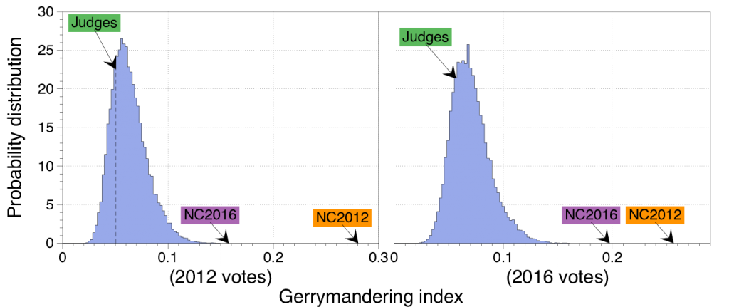
Our Gerrymandering Index measures now the structure of the order marginals of a given map diverge from the expected structure summarized in the above box-plots.

Again, we see that the NC2012 and NC2016 Congressional plans are both outliers in our ensemble of maps while the Judges plan is not; again showing that NC2012 and NC2016 Congressional plans are more alike than the Judges plan.
The details of this analysis are explained in the papers Quantifying Gerrymandering in North Carolina and Redistricting: Drawing the Line.
