This post continues the theme of localized analysis begun in the post Towards a Localized Analysis. The analysis presented in our articles and blog post such as The Signature of Gerrymandering , Firewalls, and Hearing the Will of the People are largely based on a global, statewide analyses. In many ways, Gerrymandering is a global phenomenon as one can not change one district with out effecting its neighbors which often causes a cascade of changes across a state. Packing a particular group in one district is done to dilute the groups effect in other districts.
The most basic measure of a districting plan’s character is the partisan make up of its elected representatives. When comparing a plan’s partisan make up with a set of comparison maps, we obtain a view that is fundamentally global in measuring gerrymandering. Marginal box-plots can be used to identify particular districts as unusual. This is a step towards a more localized analysis. As described in The Signature of Gerrymandering post the marginal box-plots of the ranked vote curve were used to identify specific districts, in the legislatures 2016 maps, which were arguably cracked and packed in court case Common Cause v. Rucho concerning the 2016 NC Congressional maps.
In the Marginal box-plots, a particular set of votes is used to order the districts from most to least Republican in the ensemble of districting plans; to examine a particular district in a given plan, we first consider the district’s rank in the order (from most to least Republican) and then compare that district’s partisan make up with the partisan make up of the districts in other plans with the same rank in the order. Such analysis examines deviations in the the overall statewide structure of votes along with with where this deviation may occur, but it does not geographically constrain the districts with which to compare the district of interest.
We wish, however, to perform a more geographically localized analysis. Such analysis still contains the fundamental framework of examining outliers within the context of an ensemble of nonpartisan maps. (Outlier analysis using an ensemble of maps is generally discussed here. The basic idea of the localized analysis was previously presenter here.)
The Typical Local Political Environment of a Precinct
Localized analysis begins by choosing a particular precinct of interest and collecting the districts containing this precinct from an ensemble of state wide maps. The resulting collection of districts, all which contain the precinct of interest, can then be used to characterize the typical district-level political environment that voters in this precinct could expect to experience.
By contextualizing a precinct within the collection of districts containing it, we may relate the partisan preferences of the precinct’s voters to the preferences of their typical district. For example, a precinct’s voters may prefer one party, but typically find themselves in a district that votes for the opposing party; in this sense we may determine whether or not it is natural for the typical voter within a given precinct to be able to elect a candidate associated with the party they have voted for.
We contextualize the typical district containing a precinct by constructing a histogram over the ensemble of districts (this process was described in detail the previous post Towards a Local Analysis.) This distribution can then be used to deicide if the district containing the precinct in a given plan is atypical. If a precinct does find itself in an atypical district, then its residents may have cause to object. In this way, the ensemble of districts can be used in a normative way to identify outliers.
Extreme Outliers in the NC Congressional Races
Similarly to our previous blog post (Towards a Local Analysis) we again apply the above analysis the North Carolina Congressional Map from the 2016 and 2012 elections which we will abbreviate respectively NC2106 and NC2012. We will also consider the map produce by the retired judges from Beyond Gerrymandering Project lead by Tom Ross. This map will be denoted “Judges”. Previously we used a 5% outlier condition which many may classify as rare, but is more arguably extreme. We adapt the current analysis to examine more extreme outliers (those that occur less than 1% of the time, rather than 5%).
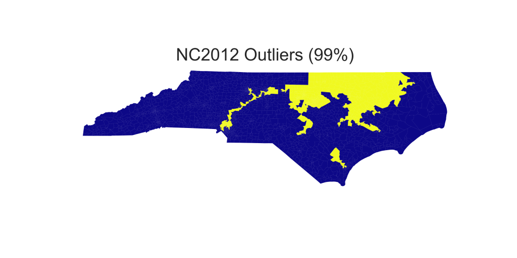
We begin by analyzing each precinct to determine if the district counting the precinct in the map of interest has an unusual partisan make up from that precincts perspective. Precincts which find themselves in a district whose partizan make up is in the in tails corresponding less than 1% of probability are labeled as extreme (at p=99%)
In the table below, we show the number of precincts which are extreme outliers from 2,692 predicts in different NC Congressional maps for the using the 2012 and 2016 US Congressional elections, denoted by USH12 and USH16 respectively. For comparison purposes, we then tabulate the number of maps in our ensemble which have that many or more precincts which are extreme outliers.
| Map | 2012 Votes | 2016 Votes | ||
|---|---|---|---|---|
| # Outliers | # in ensemble w/ more outliers | # Outliers | # in ensemble w/ more outliers |
|
| NC2012 | 796 | 0 (0%) | 655 | 0 (0%) |
| NC2016 | 154 | 336 (1.4%) | 233 | 76 (0.31%) |
| Judges | 2 | 15022 (61%) | 3 | 13448 (55%) |
The histograms below give the full histograms of the number of maps with different numbers of outlier precincts using the two sets of election data mentioned above.


The spatial location of each of the outlier districts is show on the following maps. The first three us the US12 election data


The second three use the USH16 election data.


Precinct by Precinct Log Likelihood
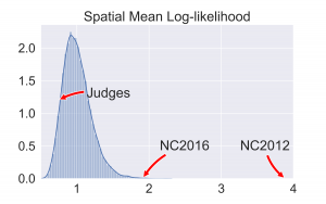
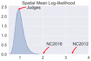
Instead of just using the using the precinct localized distribution constructed above to flag districts individual as outliers, one can calculate the likelihood of partizan vote fraction being as far or farther in the tail then that each precinct in a given map. Averaging this across the state gives a measure of how typical the precinct by precinct are across the whole map. To contextualize this average spatial log likelihood calculate the value for each map in our ensemble. The following two histograms summarize the results.


Again to show the spatial structure better, we plot the log likelihood across the state, precinct by precinct. So that the direction of the swing is visible, we label democratic with positive values and republican with negative.


The above maps use USH12 election results while the maps below use UH16 election results.


