By Amanda Mathew, Anna Huck, and Jessica Lee (2015)
Introduction
In her article “The Institutional Matrix: Publishing Romantic Fiction,” Janice Radway describes how the difference in readership of romance novels changed how they had to be published and marketed in comparison to other literary works. For example, the Beadle brothers “reasoned that if they could take the traditional risk out of book publication by identifying their potential audiences more successfully, they might avoid the common losses that came with overproduction and poorly directed distribution.”[1] As one publisher found an effective method for distribution, others would follow suit. The technological innovations that allowed for mass production enabled publishing to turn into a commercial industry. As a consequence, publishers began using magazine and newspaper distribution systems and later grocery stores and pharmacies to market and distribute romance novels, attempting to target specifically their female readership. In a similar manner, Sarah Frantz Lyons and Eric Murphy Selinger discuss how the founding of Romance Writers of America in 1980 and the resulting annual conferences “[brought] editors, agents, and authors together, and which therefore lend[ed] themselves to an increasing self-consciousness and epitextual standardization of the genre, a clarification of what popular romance ‘really is’ in the eyes of key industry participants.”[2] This same standardization is apparent in the study of book covers. Because a book cover plays an important role in the branding of a novel, romance novel book covers evolved as fads; the book covers of successful romance novels were used as models for future books. Some fads have had brief periods of popularity while others have remained prevalent in the industry. [AH]
Our investigation will cover an overview of five main fads seen on popular romance novel covers: clinch, headless, room with a view, object, and cartoon. These fads were chosen based on prominent author Julie Ortolon’s analysis of book covers discussed on her blog post “Romance Readers Weigh in on Covers from Print to eBook.” We have chosen example covers from these fads that either exemplify that fad or were influential books in the industry as a whole. While these fads have had time periods of prominence, some, like clinch, have had an overwhelming impact on covers such that they have lasted for thirty years. For this reason, some of our examples were taken from more modern books to show the lasting impact of the most popular fads. Then, we will later discuss the application of these fads through the case study of Pride and Prejudice. Finally, we will look at how particular publishers chose to use book covers to brand their novels, examining Harlequin in particular. [AH]
Clinch Covers
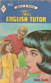
The “clinch” cover typifies the romance novels of the 1970’s and 1980’s. Prior to the 1970’s, covers were more modest and chaste, only hinting at sensuality. The characters were not touching and were professionally dressed; for example Harlequin’s The English Tutor (1968), written by Sara Seale, features drawings of three characters in a uncompromising scene.[3]
As the seventies progressed, the “embrace builds in intensity, turning the cover into a sign for sexual desire.”[4] Featuring couples locked in a tight, passionate embrace, wearing barely-there clothing, these covers are where the “bodice ripper” nickname that so many people now associate with romance novels originated. In fact, a few of these covers actually show the bodice in process of being ripped, so that correlation is not unfounded. Clinch covers, presenting “scantily clad women, often in peril and caught up in the arms of [or in close proximity to] stalwart, virile men, soon became the norm.”[5] Julie Ortolon (2011) wrote on her blog, Julie’s Journals Online, that because these novels had such graphic images, readers were subjected to criticism and “hid [the books] behind brown paper to avoid ridicule.” Others, like Ortolon herself, love them.[6] According to Sarah Wendell from Smart Bitches, Trashy Books, “‘Many readers…hate it. Hate it. At best, the clinch can be a visual exercise in technicolor hilarity, or at worst a complete and total embarrassment for the reader. But clinch covers will probably never go away: they sell.’”[7] [AM]
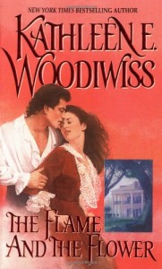
One classic example of the clinch cover is the original cover of Kathleen E. Woodiwiss’s Flame and the Flower (1972).
The cover of Flame and the Flower presents a passionate embrace between the hero, Brandon, and the heroine, Heather. The positioning of the two definitely emphasizes the high levels of sexual tension the pair will endure throughout the book. Brandon’s hand almost appears to be pulling Heather back closer to him; his hand appears to be tightly gripping her arm as if he is preventing her from escaping. Heather, like in the story, seems reluctant to be near him but still desires his touch. Heather’s face is drawn to express desire and lust, but her body language–how she gives the impression of straining forward and away from Brandon–expresses unwillingness. Interestingly enough, unlike what was described in the previous paragraph, the book cover does not include the couple undressed. Many clinch covers have the hero shirtless and the heroine in a compromising position or suggestive pose, and almost always is the woman in the process of being undressed. In this case, the heroine has very little skin showing, which almost seems antithetical to idea of the clinch cover being one of the most sexualized types of covers. [AM]
Even though fads come and go, the clinch cover has remained popular with readers of romance novels. “Kate Smith, founder of www.romancingtheblog.com, believes that while the clinch is ‘definitely old-fashioned, it exists for a reason.’”[8] These covers are so iconic that readers know what they are getting when they see the cover. Novels with clinch and bodice ripper covers have “found their way into the public eye” and have continued to stay there.[9] But due to the changing tastes and expectations of the characters, the clinch is “always evolving…it doesn’t have to be the clinch of 20 years ago.”[10] Jennifer Enderlin, the Vice President and Associate Publisher of St. Martin’s Press, does agree with the previous statement by saying that “the clinch should change with the times and “‘be done in a modern way. If you feature a hero and heroine together on a cover, it needs to reflect some equality between the two.’”[11] Regardless if you love it or hate it, the passion, desire, and sexual tension of the clinch cover has remained a popular cover design for many publishers. “Vestiges of [the clinch] cover linger on…and have branded the genre [of romance] indelibly,” especially through the indirect formation of the “headless” covers.[12] [AM]
Headless People Covers
In recent years, headless people have been gracing the covers of popular romance novels. These covers span multiple sub-genres of romance: historical, paranormal, and small-town contempory to name a few. According to Jeyashree Kamble, an English professor at City University of New York, the bare masculine chest and headless people appeared in the late twentieth century, but only became popular in the past decade.[13] Usually the photographed person has their head chopped off roughly above the torso, but sometimes the lips and nose are pictured as well. Nara Schoenberg, a Chicago Tribune reporter, says that the heroine pictured on the cover can be dressed in a full range of clothing, from “Elizabethan finery, an antebellum gown, to a plain white T-shirt or a frilly purple swimsuit.”[14] Certain images, such as the style of clothing, suggest a time period or a subgenre of romance in order to attract the potential reader into the book. Some publishers that Schoenberg contacted have said they leave the head off for practical reasons, like “the lack of a surviving portrait of Jane Boleyn,” aesthetic reasons, to create a specific “atmosphere,” and psychological reasons. Schoenberg interviewed Vaughn Andrews, the creative director of Harcourt, and he remarked that by not photographing a face, it could make it easier for the reader, most likely a female, to identify themselves with the protagonist of the story by filling in the details and very easily inserting themselves into the story.[15] A similar comment by Kamble supports Andrew’s claim: by erasing the faces, it would be able to promote reader identification with both the hero and the heroine because it “depersonalizes the characters.”[16] [AM]
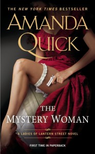
The female bodies that are pictured can be highly sexualized, like on the reissued cover of The Mystery Woman by Amanda Quick (2013).
Here, it is obviously a historical romance, given her dress, but the shadowing of her face allows the reader to imagine what they envision the heroine would look like. However, the counterargument could be made that the headless cover is demeaning towards women because it perpetuates the idea that women are valued only for their body and not for their intelligence, uniqueness or their character. One blog, Stacked Books, did an article called “Cover Trends and Female Bodies,” focusing mainly on how covers misrepresent female bodies as overly sexualizing books. Kelly Jensen, the author of this blog, made an important comment about the headless trend specific to young and new adult books, but the comment can be generalized to many headless female romance novel covers. Because the reader only sees the body, it “becomes the object of judgement…the girl attached to the body doesn’t matter.”[17] The most recent cover of The Mystery Woman has the main focus point as the bared leg and the gun the heroine is holding; the female protagonist has been reduced to this singular physical aspect. [AM]
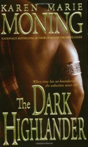
But this trend is not limited to only female bodies. Some of the most sexualized covers actually spotlight the hero, focusing only on his bare chest. Jennifer McCartney interviewed Leslie Kelly, New York Times bestselling author and Romance Writers of America board member, who said, “They usually show the guy from the jaw down, because most readers want to fill-in-the-blank in their mind with the hero’s face. But a hot body will always catch a reader’s eye.”[18] There are numerous books which feature lone bodies with minimal clothing to suggest which time period the novel is set in. For example, The Dark Highlander (2002) and Mr. Impossible (2005), featured below, show the Scottish warrior and the Regency aristocrat, respectfully. The absence of the traditional clinch cover, replaced with faceless or headless characters, “will still perpetuate the sexual reputation of the genre” but will do so without the unrealistic and dramatic look that typified clinch covers of the 1970’s.[19] [AM]
Currently, the shirtless, and mostly headless, covers represent the paranormal/ supernatural subgenre of romance. Again, these covers are what draw the reader’s attention and notify them what kind of book they are reading. Nalini Singh’s Kiss of Snow (2011) is a typical example of a paranormal romance cover for today.
The same psychological principle is upheld–with the face missing, the reader can project whatever face she want onto the man’s body. These shirtless males are the current trend in romance novel “headless” covers. The objectification of the male body might be seen as a response to the intense sexualization of the female body. Kamble has also claimed that the “omission of female characters [on the book covers] suggests to the readers [who are mostly female] that they can identify completely with the female protagonist.”[20] The reader no longer has to try to paste her own face over the body of the model. According to Kamble, the reader can insert herself directly into the story. [AM]
Room With a View Covers
The clinch cover, for all its popularity, has also received a lot of criticism throughout its history. One of the major issues was how the cover design started changed during the seventies; the covers used the clinch fad to catch attention rather than creating a cover that accurately reflects the plot.[21] The late eighties and early nineties saw romance covers move in a different direction. Publishers and cover artists concealed the clinch style by using objects and landscapes on the front cover, and moved the clinch image to the cover flap.[22] In this way, publishers were able to keep both styles–the clinch and the room with a view. Typically, the room with a view covers portray a location that features prominently in the storyline. These covers have been used with both historical and small-town contemporary romances. The room with a view style clues the reader in that this is a romance novel, but it also lets them know what era and place the book is set in.[23] Many readers associate books with softer looking landscapes with a sweeter, more emotion-driven romance, more so than books that have clinch or headless covers. Small Town Girl by LaVryle Spencer (1997) exemplifies the room with the view or landscape cover. The focal point is on a small house; there are no people present in the image, allowing for the hero and heroine remain a mystery to the readers. Similar to headless, the lack of characters on the cover creates an opportunity for the reader to envision the protagonists in anyway they want. [AM]
Defy Not The Heart, written by Johanna Lindsey (1989), features the medieval castle of the knight Ranulf, the hero. [AM]
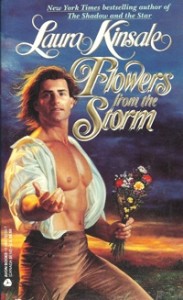
From the image, it is clear that this is a historical romance, but it also indicates to the reader the setting where and when the book takes place in. Book covers, as well as their audience, have evolved from the 1980’s; many publishers often issue reprints of the same book, but with different covers. It is important to note that the cover of Defy Not The Heart shown above is not the original cover from 1989. Overly sexualized and dramatic, the original covers shown below immediately draw attention to themselves as romances. A similar case to Defy Not The Heart is Laura Kinsale’s beloved romance Flowers From The Storm (1992).
The original covers of Defy Not The Heart and Flowers From The Storm are the typical clinch or “man-chest” covers of the seventies and eighties. Both of these books are in the historical sub-genre of romance and were published by Avon in 1989 and 1992, respectively. These classic historicals got makeovers in order to be more competitive in the current romance novel market. Elizabeth Camden, a published romance writer, is grateful these books changed their typical eighties style clinch covers to be room with a view covers. She knows that as mainstream novels, Defy Not The Heart and Flowers From The Storm had to conform, but these “books contain much more emotional depth, character development, and downright good story-telling than the original covers would suggest.”[24] [AM]
Object Covers
Object covers are by far the most simplistic type of cover, usually featuring an object such as a flower and stylistically pleasing font. Carol Irvin of the blog All About Romance describes the parallelism between using flowers on object covers and using partially dressed men on clinch covers: “since flowers are the sexual organs of plants, one could say that the symbol is merely replacing the human body on those covers.”[25] In this way, the object can symbolize the romance or sexual nature of the novel. [AH]
In discussing book covers at the first annual Romance Novel Convention in 2014, Jimmy Thomas explains cover art in terms of how it markets a book. Thomas is both the founder of the Romance Novel Convention but also a cover art model in stock photos that can be bought online for prices ranging from $1 to $300. Although Thomas provides clinch covers in his stock art, he was asked how 50 Shades of Grey was successful, despite its lack of a shirtless man or other symbol of its erotic nature. Thomas responds that “With Fifty Shades it was the marketing…For example, Fabio. Fabio’s only been on two hundred something covers. It’s like, why is he so known? Because he got on TV. Then everybody saw him. Not just the romance readers saw him, but everyone in the world.” Fabio was a very successful cover model for romance novels in the style of the clinch or headless fad during the 1980s and 1990s. For Fifty Shades of Grey, it was the suggestion of the erotic theme by the cover coupled with the vague rumors of intense sexuality transmitted through marketing that sparked the mass public’s curiosity and made author E. L. James $95 million in 2013.[26] [AH]
The original cover of Fifty Shades of Grey features a silver tie draped diagonally across the cover; the focus of the image is on the knot of the tie. The image, however, does not explicitly convey the BDSM sex that protagonist Anastasia and hero Christian Grey engage in. According to Sarah Wendell from Smart Bitches, Trashy Books, the novel relied on its “secrecy element”: “50 Shades is popular because of the combination of elements…among them the very mysterious and barely glimpsed alpha-male point of view, and the presence of a very innocent heroine being inducted into a secret, sexually charged environment.”[27] It is for these elements that Fifty Shades of Grey was so popular and spread through word of mouth–it capitalized on the mystery of its contents. In addition, Hadley Freeman of The Guardian analyzes how the tie is representative of the billionaire hero trope. For Freeman, due to the rise in billionaire tech executives who she associates with wearing t-shirts, a tie is indicative of the wealthy banker businessmen of the 1980’s.[28] While Freeman finds it troubling that men are considered more attractive if they are wealthy, the billionaire trope of alpha heroes in the romance industry has been very popular. In fact, according to the Romance Writers of America, the “sexy billionaire/millionaire” trope is the ninth most popular trope in romance fiction.[29] [AH]
Following the creation of a film adaptation of Fifty Shades of Grey, the novel was re-released with a new cover featuring a still from the movie.[30] The still shows Anastasia, portrayed by Dakota Johnson, and Christian, portrayed by Jamie Dornan, in a far more explicit representation of their sexual interactions from the book. Anastasia is tied up by her hands, and Christian is leaning in to kiss her. This reissue definitely features a clinch cover, which emphasizes the intense sexual nature of the novel that made it such a popular topic of conversation. This new cover capitalizes on the proliferation of media coverage on the explicitly sexual nature of the novel.[31] This reversal to the clinch cover portrayal of dominance and submission conflicts with the modern movement away from such portrayals. “In Fifty Shades of Grey, the BDSM fails to be consistently consensual, values the hero’s pleasure before the heroine’s, and ultimately acts as a medium for a destructive and abusive relationship to ensue.”[32] While the new cover may be successful at branding Fifty Shades of Grey in terms of the BDSM sex that earned it so much media buzz, the new cover only reinforces these problematic aspects of the novel that were not shown on the object cover. [AH]
On the other hand, the success of Fifty Shades of Grey inspired many authors of erotic romance to opt for the object cover over the more traditional clinch or headless people cover. Sarah Wendell compiled many parodies and imitations of the Fifty Shades of Grey cover in her post “Fifty Shades of Cover Art.”[33] Two examples of these imitations are reproduced below. The proliferation of the object fad on these covers following the success of Fifty Shades of Grey demonstrates how authors look to the success of other authors to model their own work. [AH]
Cartoon Covers
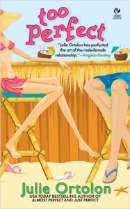
The cartoon cover usually features a couple sketched out on the cover using bright colors instead of a photo or painting. In the case of the Avon Books cover art department, these covers are made with layers of colored paper, rather than a sketch with paint or pencil. It is a book cover fad that is primarily used with contemporary romance, and it was a shorter trend in romance covers, lasting from the mid 1990s to around 1999.[34] In 2011, Julie Ortolon discussed on her blog why a cartoon cover did not work for her Perfect trilogy (Almost Perfect, Just Perfect, and Too Perfect). Released in 2005, Ortolon’s Perfect trilogy came after the peak popularity of the cartoon trend. Furthermore, the covers marketed the books in such a way that their theme was misconstrued: the fun, colorful cartoon covers were interpreted as Young Adult novels.[35] (Ortolon, 2011). For this reason, cartoon covers are usually used for lighter and less emotionally-driven stories, seen in many cases in “chick lit.”[36] On the other hand, the trilogy, thematically, is of a more serious nature, with the three protagonists confronting lifelong fears that have held them back.[37] Instead, Ortolon later released the series with covers that are better categorized as room with a view that complemented the stories much more successfully. [AH]
Case Study: Pride and Prejudice
If there is one novel in the entire history of the romance industry that could single-handedly illustrate the overarching trends of romance novel covers, that book would be Jane Austen’s Pride and Prejudice. First published in 1813, the novel has been reprinted countless times over the centuries,[38] and with each reprinting came a new cover to appeal–or try to appeal–to romance readers of the time.[39] Arguably, it was the 1995 BBC TV mini-series adaptation that launched Pride and Prejudice and Mr. Darcy into “superstardom” for modern audiences,[40] so the focus of this case study will be on Pride and Prejudice covers post-1995 and the romance novel cover trends with which they correlate. [JL]
It seemed inevitable that someone would publish a new edition of Pride and Prejudice featuring the famous, seemingly timeless clinch cover. In 2009, Heritage Classics published another reprint and on the cover was an unmistakable clinch: the distressed heroine Elizabeth, with just a hint of her bosom peeking out from her neckline, wrapped in the protective, possessive embrace of the debonair hero Darcy. This edition was not well-received, as evidenced by a Pride and Prejudice fan blog that voted it “Worst P&P Cover.”[41] The rise of the clinch cover for romance novels is often credited by the publication of Kathleen Woodiwiss’s The Flame and the Flower in 1972 and today still remains common.[42] However, as evidenced by readers’ negative reception, this is a case where publishers chasing cover fads failed. Austen’s novel, especially compared to a more modern romance like The Flame and the Flower, contains very little sex and sexuality, so the steamy clinch cover is incongruent with the actual plot and the main characters themselves, Elizabeth and Darcy. [JL]
In 2010, Tribeca Books published a rather Young Adult-appearing reprint of Pride and Prejudice. A girl wearing a formal white gown sits on a red sofa, and Jane Austen’s name is scrawled in the bottom corner in a handwritten font. This cover conforms with the headless trend in romance novels: the hero, heroine, or both are featured on the cover, but they are cut off at the neck, chin, or nose, before any distinguishing features can be seen by the reader. As this fad is popular because it allows readers to use use their imaginations to create how main characters look, the publishers of this edition of Pride and Prejudice seem to have decided to go headless for reasons stated earlier: the reader is able to transpose her own imaginings of the heroine’s face onto the cover model. [JL]
In 2000, W. W. Norton & Company printed an edition of Pride and Prejudice with a cover featuring an oil painting on canvas, Malvern Hall, Warwickshire, of a Pemberley-esque home overlooking scenic grounds.[43] It is possible this cover was inspired by the room with a view trend, but a quick look at the publisher website’s listing of its Norton Critical Edition novels, among which is Pride and Prejudice, shows that quite a few of its other books, romance and non-romance, possess room with a view and similar covers, as well as similar templates for the cover design.[44] The consistent use of a template and also of scenic cover images makes it possible that, rather than pursuing fleeting cover fads, the publisher is seeking a more constant book branding, or specifically, publisher branding. In branding, the “goal of the cover is to evoke some coded message for the reader,” and in publisher branding, this coded message is intended to link “its collective group” of authors so that a reader of one author is, based on a conscious or subconscious recognition of patterns between book covers, drawn to another author affiliated with the same publisher.[45] The template that the publisher uses for its book covers makes the connection between its novels obvious. Thus, the Norton Critical Edition of Pride and Prejudice shares very similar cover elements with other Norton Critical Edition novels because of publisher branding, not because of the room with a view fad. [JL]
In 2009, HarperTeen included Pride and Prejudice in a series of reprints of classic romances alongside Emily Bronte’s Wuthering Heights and Shakespeare’s Romeo and Juliet, intended for a young adult audience. The cover of Pride and Prejudice features red and white flowers against a black background, with white text that looks similar to, if not the same as, the font on the cover of Stephenie Meyer’s New Moon, not to mention the overall similar cover design . This is clearly an object cover and seems designed to appeal to Twilight fans, as if HarperTeen hoped that, by imitating Twilight’s cover, they might also “take a bite” out of its success. HarperCollins claimed that the “cover art is stock photography,” so it is possible the similarity between the HarperTeen and Twilight book covers is entirely coincidental.[46] However, the resemblance between the typography, as well the fact that the cover image Barnes and Noble uses on its website for HarperTeen’s edition of Wuthering Heights in this series features a blatant “Bella & Edward’s Favorite Book” sticker in the corner, makes a coincidence seem dubious. It should be noted that non-cover aspects of the book–such as the blurb and bonus text inside–also seems to have been Twilight-ified and targeted toward teenaged girls. [JL]
There have been several Pride and Prejudice reprints with sketch-like covers, but the one that fits the most under the cartoon cover fad is HarperPerennial Classics’ 200th anniversary e-book reprint of Pride and Prejudice. The hero and heroine are drawn in a non-portrait style, sitting together on a window seat, but the cover is dominated by a bright pink background and bold, chunky lettering. Unfortunately for the publishers, their choice in cover design was not successful. Priced at $2.99, this e-book edition has had zero reviews since it was released over two years ago, and as of April 4, 2015, it is the “#1,571,003 Paid” in Amazon’s Kindle Store.[47] As mentioned earlier, the cartoon fad for romance novels was short-lived, and the reasons for its ephemeral lifespan also likely contributed to this edition’s lack of success. [JL]
Publisher Branding
Cat Yampbell claimed that “publishers treat book covers as labels to advertise brand-name authors.”[48] Jane Litte on the romance blog Dear Author claims that Harlequin, for example, is “a leader in publisher branding,” and that branding is the reason the publisher is “so strict” in their cover guidelines because they are trying to “deliver that same spirit from book to book.”[49] Harlequin’s marketing strategy is unique because they publish many romance novels monthly in particular serieses: Intrigue, Presents, and Superromance, for example.[50] Publishing houses, like Harlequin, design “romance covers to highlight the various sub-genres, i.e., formulas,…primarily in the interest of augmenting sales.”[51] Certain cover types, like clinch, have been incredibly popular, and “have branded the sub-genre indelibly.”[52] [AM, JL, AH]
Harlequin’s process for cover selection begins by authors filling out an Art Fact Sheet in which they can describe their characters and the storyline of their novel to submit to the art department. Some authors even include reference images that they used while writing the novel. After the art department reviews the Art Fact Sheet, the author meets with the art director, senior editor, and assistant product manager to discuss ideas. In this meeting, they must consider the look and feel of the particular line of books is–each of their lines has a different branding–and the branding of other books being released that month in that line–each cover needs to be distinct. Based on this meeting, the art director gives a mockup of what was discussed to a cover artist who has about three weeks to create a cover and work with the art director to revise as needed. While series covers rely on the established series brand to assist in marketing the book, single title books rely on the author to create the brand, and therefore, they spend up to sixteen months developing the cover compared to the six week process for series books.[53] This method has proven very successful for Harlequin as they publish eighty romances per month and made over $62 million dollars in the first nine months of 2011.[54] [AH]
Since their beginnings in 1949, Harlequin covers have evolved quite a bit as social perceptions of sexuality have changed: “going from vaguely suggestive to unabashedly erotic over the decades.” Between 1949 and the 1980s, Harlequin covers featured attractive men and women interacting with one another in a clearly romantic yet chaste manner. In the 1950s, Harlequin distinguished itself from other publishers by creating standard format of their covers with a title within a box near the top of the cover and the cover image underneath. In the 1960s, the characters continue to be portrayed in subdued representations of romance where their dress was professional and indicative of the middle to upper class. In the 1970s, most representations of romance between the hero and heroine remain innocent; however, the beginnings of covers in which the hero and heroine are shown almost kissing or the hero is shown bare-chested begin to emerge. During the 1980s, physical contact between the hero and heroine predominated covers.[55] According to Maggie Miller, a creative art director at Harlequin, “Many of the covers from this decade are ‘more dramatic, over the top, a little more passionate,…It’s a reflection of the ’80s, where everything was over the top.’”[56] Harlequin covers from the 1980s are obvious clinch covers. [AH]
For examples of Harlequin covers through the years, please see Venessa Wong’s article “Under the Covers: Harlequin’s Images of Romance.”
Publisher “branding eliminates the appearance of individual differences”[57] in romance novels, and the books appear to be increasingly “standardized assembly line products.”[58] Maryanne Fisher and Tami Meredith have observed how Harlequin romance covers “tend to be highly similar and match a design template for each series” as a way of distinguishing the publisher from competitors.[59] On the other hand, Jeyashree Kamble, an English professor, said, “The easy equation of formulaic image and plot invents the meaning that popular romance is generic (in the sense of being a standardized commodity).”[60] Fisher and Meredith argue that Harlequin’s cover images cater to “the cultural values of the era while displaying prominent evolutionary concerns,”[61] in that (female) readers ought to be able to see themselves as the female characters on the covers, and able to see desirable mating characteristics in the male characters. In this way, Harlequin seems to have found “the more obvious cues of couples and their families” as the most attractive cover designs for readers, so that is the type of publisher they have opted to brand as producing their books: a publisher providing romance novels that appeal to social, cultural, and even evolutionary values.[62] [JL, AM]
Conclusion
The proliferation of ebooks has impacted book covers in a couple of interesting ways. According to Leslie Kelly, New York Times bestselling author and Romance Writers of America board member, “‘While traditionally published books are still trying to grab the passerby at Walmart or in a brick-and-mortar store, [self-]published books are typically targeted toward electronic readers,’…which allows readers to choose a book with a sexy cover and still read it in public without fear of being judged.”[63] Even established publishers like St. Martin’s Press are trying to capitalize off of the demand for sexier ebook covers. For example, Lord Savage published by St. Martin’s Press in September of 2014 featured a different cover in the print edition than in the ebook edition. When interviewed by Sarah Wendell, Monique Patterson, an executive editor at St. Martin’s Press, explained that “[their] reason behind the two covers [was] pretty simple. [They’ve] found that the less explicit covers tend to do well in print, in certain accounts. However, readers who buy erotic or erotic romance ebooks tend to favor covers with couples on them.”[64]
The massive expansion in ebook reading, and therefore publishing, has caused a corollary expansion in the demand for stock photos for indie authors. The use of internet stock photos as cover images has created a number of issues for potential authors: photos can be downloaded multiple times and therefore be used on multiple covers and furthermore, the supply of more specific stock images, such as those including minorities, have even more slim supplies.[65] Both of these developments caused by the advent of ebooks mean that fad covers are not only being customized to a particular book in order to brand it in a certain way, but also the covers are also being tailored to the medium of publication. Furthermore, authors, especially indie authors, are chasing these fads more than ever to build their brand on the successful authors and novels published before theirs. It follows that book cover fads have always been popular because they were tried and true methods, but they are particularly key for authors who lack an established following, a demographic that is increasing exponentially as self-published authors are flooding the market. Going forward, there is no way to know how these fads will evolve parallel to the evolution in societal standards, but fads will likely continue to play an important role in cover design and will come and go more frequently as more and more authors use them. [AH]
Endnotes
[1] Janice A. Radway, Reading the Romance: Women, Patriarchy, and Popular Literature, The University of North Carolina Press, 1984, 22.
[2] Eric Selinger, “How to Read a Romance Novel (and Fall in Love with It),” New Approaches to Popular Romance Fiction, (Raleigh: McFarland & Company), 2014, 108.
[3] Fisher, Maryanne L. and Meredith, Tami M. “The Success behind the Candy-Coloured Covers: An Evolutionary Perspective on Romance Novels. The Evolutionary Review 3, 154-167. http://www.maryannefisher.com/wp-content/uploads/2013/09/Fisher_Meredith_Covers_TER.pdf
[4] Jeyashree Kamble, “Uncovering and Recovering the Popular Romance Novel,” (dissertation, University of Minnesota, 2008), 179.
[5] Steven Brower, Breathless Homicidal Slime Mutants: The Art of the Paperback. (New York: Universe Publishing, 2010), 60.
[6] Julie Ortolon, “Romance Readers Weigh in on Covers from Print to eBook.” Julie’s Journal (blog), March 30, 2011, http://www.juliesjournalonline.com/romance-readers-weigh-in-on-covers-from-print-book-to-ebook/.
[7] Lucinda Dyer, “The Forever Clinch,” Publisher’s Weekly, November 17, 2008, http://www.publishersweekly.com/pw/print/20081117/10857-the-forever-clinch.html.
[8] Ibid.
[9] Kamble, 199.
[10] Dyer, 2008.
[11] Ibid.
[12] Kamble, 160.
[13] Kamble, 233.
[14] Nara Schoenberg, “Off with their heads!,” Chicago Tribune, March 12, 2008. http://articles.chicagotribune.com/2008-03-12/features/0803100314_1_jane-boleyn-headless-book-choices.
[15] Ibid.
[16] Kamble, 321.
[17] Kelly Jensen, “Cover Trends and Female Bodies,” Stacked Books (blog), April 11, 2012, http://www.stackedbooks.org/2012/04/cover-trends-female-body.html.
[18] Jennifer McCartney, “Forget Fabio: The New Wave of Indie Romance Covers,” Publisher’s Weekly, February 20, 2015. http://www.publishersweekly.com/pw/by-topic/authors/pw-select/article/65658-forget-fabio-diy-covers.html.
[19] Kamble, 229.
[20] Ibid., 232.
[21] Ibid., 184.
[22] Ibid., 209.
[23] Ortolon, 2011.
[24] Elizabeth Camden, “The Evolution of Romance Novel Covers,” Elizabeth Camden (blog), August 21, 2013, http://elizabethcamden.com/2013/08/21/the-evolution-of-romance-novel-covers/.
[25] Carol Irvin, “Covers Covered by Carol,” All About Romance (blog), February 4, 1999. http://www.likesbooks.com/covrcol1.html
[26] Jesse Barron, “One genre and a billion happy endings,” Harper’s Magazine, February 2014, http://harpers.org/archive/2014/02/bad-romance/.
[27] Sarah Wendell, “50 Shades of Grey: Why Is It So Increasingly Popular,” Smart Bitches, Trashy Books (blog), March 2, 2012, http://smartbitchestrashybooks.com/2012/03/50-shades-of-grey-why-is-it-so-increasingly-popular/.
[28] Freeman, Hadley. “Why does Fifty Shades of Grey’s Christian wear a tie?” The Guardian, September 10, 2012. http://www.theguardian.com/fashion/2012/sep/10/fifty-shades-grey-christian-tie.
[29] Romance Writers of America, “Romance Reader Statistics,” MyRWA : The Romance Genre, 2014, https://www.rwa.org/p/cm/ld/fid=582.
[30] “Jamie Dornan: beardless on the new 50 Shades of Grey book cover- stylewatch.” The Guardian, November 18, 2014. http://www.theguardian.com/fashion/fashion-blog/2014/nov/18/-sp-jamie-dornan-beardless-50-shades-of-grey-book-cover
[31] Wendell, 2012.
[32] Amy E. Quale, “Pursuit of Empowerment: The Evolution of the Romance Novel and Its Readership in Fifty Shades of Grey” (master’s thesis, Minnesota State University, 2014), 4.
[33] Sarah Wendell, “50 Shades of Cover Art,” Smart Bitches, Trashy Books (blog), August 23, 2012, http://smartbitchestrashybooks.com/2012/08/50-shades-of-cover-art/.
[34] Carol Irvin, “Why Don’t They Just Call it Fiction? An Attempt to Differentiate Contemporary Romance and Women’s Fiction,” All About Romance (blog), September 26, 1999. http://www.likesbooks.com/covrcol9.html.
[35] Ortolon, 2011.
[36] Irvin, Sept. 1999.
[37] Ortolon, 2011.
[38] Sarah Morrison, “Romance that never loses its sparkle: The world’s most influential novel ever,” The Independent, January 13, 2013, http://www.independent.co.uk/arts-entertainment/books/features/romance-that-never-loses-its-sparkle-the-worlds-most-influential-novel-ever-8449400.html
[39] Jen Doll, “200 Years of ‘Pride and Prejudice’ Book Design,” The Wire, last modified January 5, 2013, http://www.thewire.com/entertainment/2013/01/pride-and-prejudice-200th-anniversary-covers/60978/
[40] Morrison, 2013.
[41] Miss Marianne, “Caption Contest Winner and Throwdown Result,” The P&P95 Forever Club (blog), April 14, 2013, http://pandp95forever.blogspot.com/2013/04/caption-contest-winner-and-throwdown.html
[42] Radway, 33.
[43] John Constable (1809), Malvern Hall, Warwickshire, oil paint on canvas, W. W. Norton & Company: Pride and Prejudice, 2000, http://www.amazon.com/Pride-Prejudice-Norton-Critical-Editions/dp/0393976041.
[44] W. W. Norton & Company, “All Subjects,” W. W. Norton & Company, 2014, http://books.wwnorton.com/books/allsubjects.aspx
[45] Jane Litte, “Book Branding.” Dear Author (blog), December 1, 2009, http://dearauthor.com/features/letters-of-opinion/book-branding/
[46] WSJ Staff, “Jane Austen and Shakespeare Go for the ‘Twilight’ Audience,” Wall Street Journal, December 29, 2009, http://blogs.wsj.com/speakeasy/2009/12/29/jane-austen-and-shakespeare-go-for-the-twilight-audience/
[47] Amazon, “Pride and Prejudice: 200th Anniversary Edition [Kindle Edition],” Amazon.com,http://www.amazon.com/Pride-Prejudice-Anniversary-Jane-Austen-ebook/dp/B00A9V9KP6/ref=sr_1_2?ie=UTF8&qid=1428178941&sr=8-2&keywords=pride+and+prejudice+harperperennial+classic.
[48] Cat Yampbell, “Judging a Book by its Cover: Publishing Trends in Young Adult Literature,” The Lion and the Unicorn 29, no. 3 (2005), 361.
[49] Litte, 2009.
[50] Holly Jacobs, “B(u)y the Cover,” Harlequin.com | Harlequin Extras, September, 2008, http://www.harlequin.com/articlepage.html?articleId=1406&chapter=0.
[51] Kamble, 218.
[52] Ibid., 160.
[53] Jacobs, 2008.
[54] Venessa Wong, “Under the Covers: Harlequin’s Images of Romance,” Bloomberg.com, February 10, 2012, http://www.bloomberg.com/bw/slideshows/20120210/under-the-covers-harlequin-s-images-of-romance#slide1.
[55] Maryanne L. Fisher and Tami M. Meredith, “The Success behind the Candy-Coloured Covers: An Evolutionary Perrspective on Romance Novels, The Evolutionary Review 3, 159-160, http://www.maryannefisher.com/wp-content/uploads/2013/09/Fisher_Meredith_Covers_TER.pdf
[56] Wong, 2012.
[57] Kamble, 161.
[58] Ibid.,181.
[59] Fisher and Meredith, 159.
[60] Kamble, 187.
[61] Fisher and Meredith, 161.
[62] Ibid., 162.
[63] McCartney, 2015.
[64] Sarah Wendell, “Lord Savage of Print, Meet Lord Savage of Digital,” Smart Bitches, Trashy Books (blog), September 24, 2014, http://smartbitchestrashybooks.com/2014/09/lord-savage-of-print-meet-lord-savage-of-digital/.
[65] McCartney, 2015.
Images Sourced From
Almost Perfect. Book cover, 2005. Penguin Group, New York.
Almost Perfect. Book cover, 2011. Penguin Group, New York.
Constable, John (1809). Malvern Hall, Warwickshire. Oil paint on canvas. W. W. Norton & Company: Pride and Prejudice, 2000.
The Dark Highlander. Book cover, 2002. Dell Publishing, New York.
Defy Not the Heart. Book cover, 1989. Avon, New York.
Defy Not the Heart. Book cover, 2011. Avon, New York.
Doobinin, Gail, New Moon. Book cover, 2008. Hachette Book Group, Inc.
The English Tutor. Book cover, 1968. Harlequin, Toronto.
Flame and the Flower. Book cover, 1972. Avon, New York.
Florella, Danielle and Massimo Listri/Corbis. Lord Savage. Book cover (print edition), 2014. St. Martin’s Press, New York.
Flowers from the Storm. Book cover, 1992. Avon, New York.
Flowers from the Storm. Book cover, 2003. Avon, New York.
Indigo, Magda, Pride and Prejudice. Book cover, 2009. Indigo2 Photography.
Just Perfect. Book cover, 2005. Penguin Group, New York.
Just Perfect. Book cover, 2011. Penguin Group, New York.
Kiss of Snow. Book cover, 2011. Penguin Group, New York.
Lord Savage. Book cover (e-book edition), 2014. St. Martin’s Press, New York.
McGuire, Jennifer. Fifty Shades of Grey. Book cover, 2012. Vintage Books, New York.
Mr. Impossible. Book cover, 2005. Penguin Group, New York.
The Mystery Woman. Book cover, 2013. G.P. Putnam’s Sons, New York.
Pride and Prejudice. Book cover, 2013. HarperCollins Publishers, New York.
Pride and Prejudice. Book cover, 2009. Heritage Press.
Small Town Girl. Book cover, 1997. Penguin Group, New York.
SoHo Books. Pride and Prejudice. Book cover, 2010. Tribeca Books.
Taylor-Johnson, Sam. Fifty Shades of Grey. Book cover, 2015. Vintage Books, New York.
Too Perfect. Book cover, 2005. Penguin Group, New York.
Too Perfect. Book cover, 2011. Penguin Group, New York.
Tse, Edwin. Shutterstock. Designed by Sarah Oberrender. Bared To You. Book cover, 2012. Penguin Group, New York.
Wild Card. Book cover, 2012. St. Martin’s Press, New York.
Wuthering Heights. Book cover, 2008. HarperCollins Publishers, New York.



















Hello! I’d like to reference some quotes for my University essay from this article, and so I’m wondering what year this was written?
Thank you.
This piece was published on February 9, 2015.