by Greta Chen.
This project explores different aspects of the four waves of feminism. While it would be impossible to capture everything that the movement represents in just seven posters, I did my best to choose meaningful moments that I felt I could adequately visualize through Photoshop. Additionally, I recognize that my perspective of women’s rights is largely rooted in Western culture, and this series is not meant to be a comprehensive evaluation of feminism but rather an evaluation of the concepts I have been exposed to.
For the title, I wanted the opening poster to be relatively simplistic in design, evoking a sense of peace since the rest of the series would be more emotional in comparison. As a result, I chose to use clean shapes and a limited color palette, as well as typed text rather than writing by hand.For this illustration, I first sketched out placements for the vines, leaves, and flowers around the text. Then, I used the paths tool to trace and clean up my sketch. To achieve the weaving effect between the letters, I duplicated the text layer and sandwiched the flowers/leaves in between. Then, I used a mask and brush tool to “erase” the top layer of letters in the areas where I wanted the flowers/leaves to appear on top. The areas I left alone would remain hidden under the top text layer.

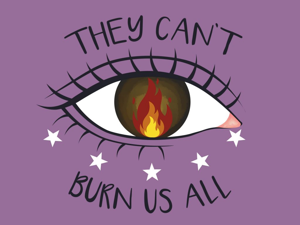
The image I chose to represent early feminism is a nod to theSalem witch trials that occurred in colonial Massachusetts. An overwhelming majority of people accused, convicted, and hung of witchcraft were women, as a result of the prevailing Puritan belief and New England culture that held that women were inherently sinful and more susceptible to damnation than men were. The gender context of witch hunts during this time demonstrates how, from the very beginning, women were viewed as weak and vulnerable, and those who did not conform to the norms of society were more likely to be targeted.


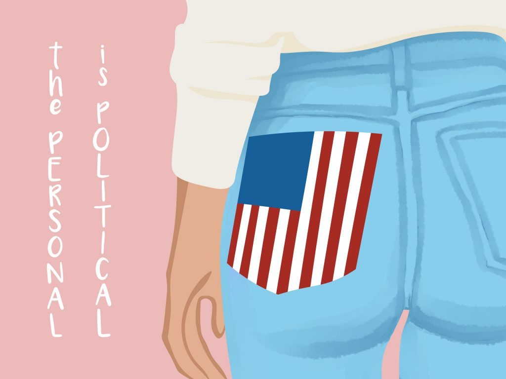
One shift that occurred from the first wave of feminism to the second was that from political equality to social equality. In particular, Betty Friedan’s The Feminist Mystique is credited for helping spark this change in focus. The book challenged the sexist culture that taught women their place was in the home, arguing that women could not necessarily be fulfilled by their housewife-mother role. Consequently, I chose the phrase “the personal is political” to represent this shift.

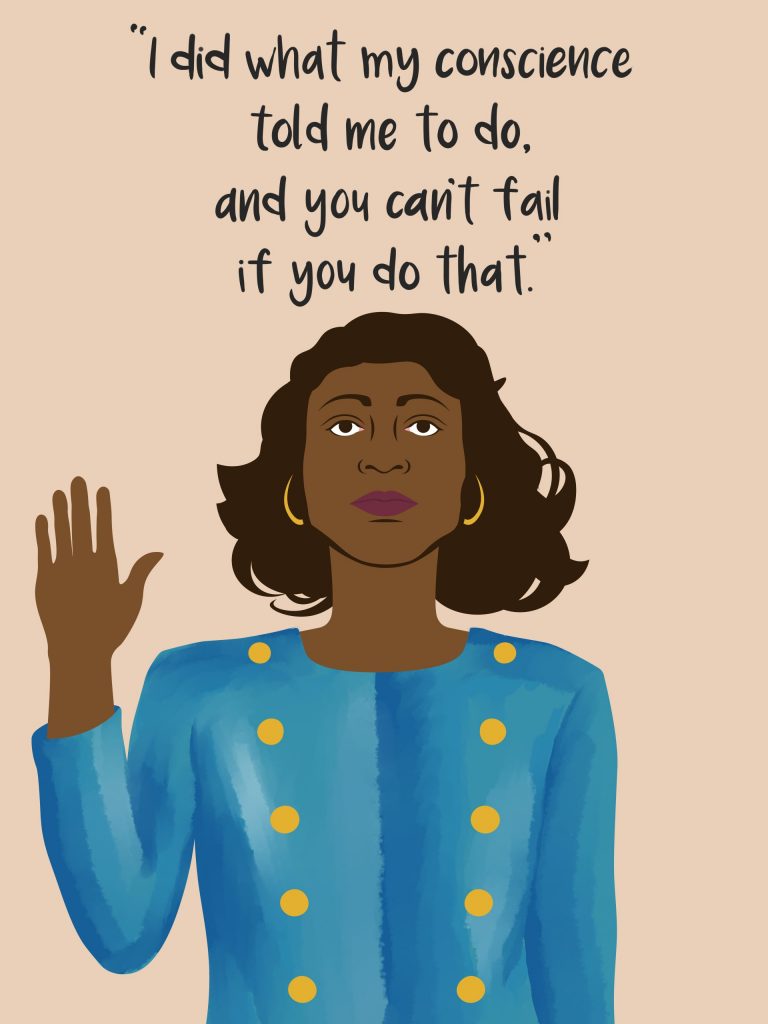
For the third wave, I chose to paint Anita Hill for two reasons. First, as more women began working, greater emphasis was put on workplace equality and harassment. Second, while the earlier waves were largely white, over time the feminist movement began becoming more intersectional, especially following the U.S. civil rights movement. Hill’s testimony against former boss Clarence Thomas during the latter’s confirmation hearing for the Supreme Court garnered extensive public attention, and recent events clearly show that the fight that Hill began is not over.


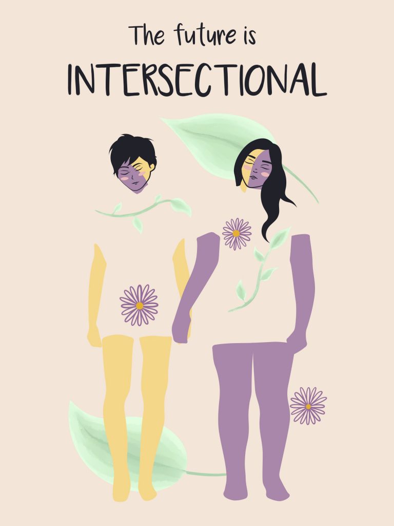
For my design on what the future of feminism may look like, I had two main ideas. The first was to focus on placing women in positions of power both politically and economically. However, I was unsure of how to portray that concept concisely, so I chose to focus on the second idea of intersectionality. The reality is, a win for a white, cis-gendered heterosexual woman is not necessarily a win for all women, and a large part of feminism remains centered on privileged women with power. Thus, I wanted to use different shapes and colors to convey a sense of connection and unity across identities to conclude the series.
Be First to Comment