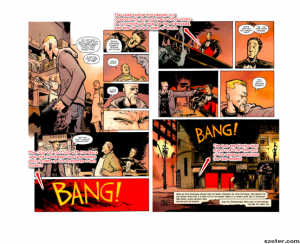
I had never read a graphic novel until this past weekend. I loved reading Daytripper by Ba and Moon, because it was an easy and short read, but it conveyed so much more emotion than most books that I have read. Discussing the novel in class, the thing that resounded with me the most was the use of vivid colors by Ba and Moon. I noticed that the protagonist, Bras, did not have the most expressive reactions, but the set background is what gave each scenario life. The way that Ba and Moon strategically used the contrast of colors in between scenario or chapters was extraordinary. For example, the author rarely used bright red, but the bar scene in which both Bras and the bartender are shot at point blank is completely red. As a reader, all the red is very overwhelming and really heightens the reader’s senses, essentially transferring the character’s emotions off the page. In the scene, Bras’ face expression is pretty dull, not because he is bored, but because he is basically frozen. The loud red is what reveals that sentiment without needing to overly focus on the face expression of Bras in a graphics perspective.
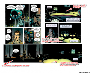
Another color that Ba and Moon use in transferring emotion is the color black. When there is a lot of black within the scene, Ba and Moon are trying to create a sense of urgency or mystery. The scene where Bras goes to search for his best friend, Jorge, the deliberate black in the scenes reveals desolation and the character’s journey for answers. Jorge had just told Bras that he is going to do something with his life because he is tired of where he is at. Bras immediately hears this and craves the need to try and help him or talk to him. The urgency or desperation in Bras is revealed by the dark color tones as he is driving towards Jorge. These examples demonstrate how ingenious Ba and Moon were in their efforts to making this graphic novel very compelling to the reader.


