Utilizing Media Tools to Augment Scientific Journal Articles
Author: Kim Arena
1. Introduction to Scientific Data
Scholarly journal articles are the primary means through which scientists communicate their research to the scientific community, and through reading and sharing these articles they are exchanging data. How this data is interpreted and received depends on how it is understood by the audience. For other scientists who are familiar with the material, the articles can be conceptualized and the data becomes relevant. But how much information does the data truly hold?
The way that we visually view text alters the way we understand its content, thus augmenting text expands our interpretations and increases the limit of knowledge that can be obtained with each form it takes. In her novel How We Think: Digital Media and Contemporary Technogenesis, N. Katherine Hayles explains, “The more one works with digital technologies, the more one comes to appreciate the capacity of networked and programmable machinery to carry out sophisticated cognitive tasks, and the more the keyboard comes to seem an extension of one’s thoughts…” (3, 2012). Augmenting the text of scientific literature can alter the reader’s perception and interpretation of both the literature and the data, establishing a connection between the concrete and abstract ideas associated with scientific research and expanding the range of understanding that can be obtained from the work. By receiving the information in a one directional manner, we limit the range through which the data can be received, and subsequently limit the interpretations and influences the data holds. What if we expanded the audience that could understand the data? People think differently when data is presented through different medias, therefore why not expand the boundaries of how data is represented? Remediating scientific journal articles through a variety of text and data analysis tools can clarify data and expose patterns that may have been overlooked. Remediation, a concept created and explored by Jay David Bolter and Richard Grusin, argues that new forms of visual media enhance and rival traditional media forms, thus establishing their own cultural significance. In this case, the added dimension of the media elements establish a deeper meaning that goes beyond the confines of text. In this essay, I will expand Bolter and Grusin’s argument and explore how remediations of scientific works through various visualization tools become meaningful in relation to the data they present.
2. Remediation of Data
Different forms of representation make certain elements of scientific research easier to understand for certain people. If people think in different ways, why not mediate data in different ways too? For scientific data, interpretation is the key to extracting the most information and subsequently utilizing that information to make advances in research. Scientists are constantly exchanging data by reading others articles and basing their own studies off of the information they gather. Remediated data presents an alternative way of “reading” scientific literature that can expand the areas of relevance and importance of the data itself. It can highlight aspects that may not be presented in the scientific literature, but that are related to the impact the goal of the research will have. Cultural theorist Lev Manovich defines information visualization as “…a mapping between discrete data and a visual representation”, and distinguishes a difference between information and scientific visualization, claiming “…information visualization is distinct from scientific visualization in that the latter uses numerical data while the former uses non-numeric data such as text and networks of relations” (Manovich, 2011). Information visualization allows us to explore what lies behind the numbers, as the text of an article is just as much data as the numerical information is.
3. Utilizing Text Analysis Tools
Using certain text analysis tools, such as Wordle, can establish a relationship between words used in the article by highlighting the ones most commonly utilized. Wordle is a
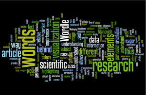
tool that generates an image based on the reoccurrence of words throughout a text, in this case scientific articles. The image is randomized, though sizes of words are relevant to the frequency at which they occur, highlighting their importance. The generator allows the creator to manipulate the general orientation of the words and the colors that are incorporated as well. Overall, the piece becomes an interpretive form of an in depth work. This presentation of information demonstrates important elements of the research, extracting the main ideas represented by the specifics of the data. This visualization strips the data of the complex aspects and simplifies it in a way that can be understood by a multitude of audiences, regardless of their level of scientific knowledge. This visualization alone would not necessarily have a major impact on research, and should not be used as a source of information on its own, yet when paired with the scientific article itself, it introduces artistic elements to a concrete idea that can help to increase understanding of the article and its relevance in relation to applications. Manovich explains, “Displaying the actual visual media…helps the researcher to understand meaning and/or cause behind the pattern she may observe, as well as discover additional patterns” (Manovich, 2011).
Scientific literature can be confusing and can contain many terms that are not understood by people unfamiliar with the particular field of research. Visual representations, like Wordle, text2image, and various Voyant Tools, can allow any person to be able to appreciate the importance behind scientific research and understand the relative connections and interactions between particular elements; the art offers a different perspective, and the way a piece is perceived determines how it will be determined and thus how its’ significance will be decided. The breakdown and remediation of research allows the reader to grasp a basic understanding of the subject, and because it is presented in an unconventional manner, it expands our interpretation of the subject. The article provides the data; the visualization kick starts our brain to think in alternative manners. In Wordle, for example, the interpretations are not influenced only by the words, but also by the orientation of the words, the colors of the words, their sizes, and their position relative to one another. The artistic elements connect with the reader’s emotions and thus gain access to past experiences, therefore every person will experience the visualization in a different way. It could remind them of a family member, of a specific moment; the generation of words could simply set a certain mood. In this case, these different effects come together to shape perception and thus attitude towards the research that lies behind the art.
4. Data Visualization
The multitude of interpretations that can be extracted from such a simple concept as a word cloud open doors to the utilization of scientific research and expands its reach, both in relation to audiences and information. On a simple level, the visualization of research increases the amount of people who can become informed of research that is being conducted. This can especially be helpful for people who are interested in learning about a particular disease, or similarly for people who have been personally affected by a certain illness. The most accurate way to find information regarding research would be through direct scientific journals, yet the figures and jargon used in the articles is often over the average person’s head. The textual visualization can also be used to spread awareness about a disease and the research that is being conducted. Take breast cancer, for instance. Many people are aware of what it is and that it affects an increasing number of people every year, but how much do they really know about the science behind it? Visualizing a scientific article on the affect a particular gene has on the disease introduces terms such as “inhibiting”, “suppression”, “agents”, “oglionucleotides”, “overexpression” and others throughout a spatial design. When the textual visualization is first seen, the two words that stand out the most are “breast” and “cancer”, surrounded by the specific terms that make up both this particular image and the disease itself. The image is a piece of art, composed of research. The introduction of new words, presented in association to
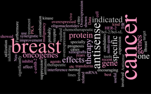
known words, can prompt viewers to delve further into the science aspect. The artistic aspect can also open ideas regarding the research that the concrete text itself cannot, and though these ideas may not directly affect future research, it expands the influence of the research conducted and leads to an overall increase in knowledge. The added dimension also opens the opportunity for connections to be made. Everything thinks differently, and sometimes simplifying things could cause the viewer to visualize associations that may be shielded by the complexities of a conventional research journal article. The artistic element itself should not be overlooked as well. The colors and orientations of the words create an atmosphere that goes beyond the hard facts. For instance, a black background behind pink words can associate the dark world surrounding breast cancer being brightened by the research conducted and updated everyday.
However, textual visualizations, such as Wordle, should not replace scientific articles but rather can be used alongside them as an additional element. Wordle cannot relay facts and would not allow for any conclusions to be made in respect to the data that was collected. The use of Wordle as a visual representation is merely that–a representation, one that cannot stand on its own as an information source. Using Wordle as the primary form of interpreting data would lead to confusion and misinterpretation, as the randomization factor of the tool could cause certain aspects of the orientation of words to become misleading in their meaning. Worlde can be used to spark interest in a topic, but it cannot itself become a source of data. That being said, it does not mean that Worlde is entirely meaningless as a visualization, as its uses were previously described. When experiencing the word cloud, it must be taken into consideration that it is not a source of data, but rather an artistic interpretation. The reader must understand that Wordle does not communicate information but rather augments it. This augmentation of data can communicate themes and topics, but not concrete data. Misunderstanding this distinction could take displace the reader even farther from the true data, thus it is important to understand the role that the media visualization plays in relation to the data it involves.
5. Data as Information
Scientific articles can also be enhanced in ways that augment text to create interactive elements, thus putting the reader directly in contact with the information. The tools used to generate such elements allow the viewer to explore the article on their own, adding a dimension of discovery that complements the purpose of the research. Interactive representations incorporate scientific and artistic components while also adding a learning aspect that forces the viewer to work together with the information to establish an understanding. The level of understanding that accompanies the tool is up to the viewer and how they interpret the data as they explore the media. The context of the article can be comprehended in relation to how it is expressed by the media tool. For
example, Voyant Tools’ Word Count Fountain reveals a text based on word relevance, similar to Wordle. However, in this form each word is represented by a bouncing dot that travels across the screen, forming a stream of dots. The amplitude of the dot corresponds to its relevance in the article, and the viewer accesses the word by mousing over the dot. The constant movement of the dots causes the words to flash on the screen as they overlap with each other, subconsciously linking the words to one another as they are read off the screen. Moving the mouse around gives rise to more words and numbers, thus the viewer can piece together the article, as the more and more words are uncovered. The differing interactions that vary between each viewer allow for a multitude of interpretations of the data based on how the words are revealed and how the brain connects the interactions that are experienced.
6. Data as Art
It is not just the words in a research article that are important—after all, words themselves are only representations of concepts that we have come to accept. The actual data, not just the textual descriptions, is also important when interpreting a scientific article. The data, too, can be manipulated and viewed in an artistic and visual manner using a variety of media tools. Data isn’t restricted by the confines of text and numbers and can be organized into visual components. Conventionally, graphs and figures are generated and illustrated to demonstrate relationships between data, a form of visualization that allows us to establish connections between particular components. While these forms have artistic elements in and of themselves, the audience to which they speak is restricted, as the interpreter must be able to understand the visual and that often requires background knowledge on the subject matter to fully grasp the connections. Visual media can take data and transform it into a visual that can be interpreted in a variety of different ways, and no specific way is necessarily correct. That is the beauty of art and danger of visualization—it is open to be perceived through the eyes of the viewer as well as the eyes of the artist.
One media tool, text2image, demonstrates this concept of turning data into art, and thus opening its interpretations. While a graph or figure has a set interpretation that it aims to portray, art takes data and presents it in a different light that may not have a directive. Rather, the piece adds a dimension that aims to simply broaden the ways the data can be understood. This could be good or bad, depending on how the data is interpreted. Much like Wordle, misinterpretations could deviate the reader from the factual aspects of the data. Text2image takes data and converts it to an image that varies in pattern and color. While the image may not aim to extract a specific point from the data, the image does not
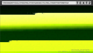
strip it of all meaning. For example, using text2image, the sequence of Brca1, a gene that plays a major role in breast cancer and is a main focus in cancer research, can be input into the generator and an image can be created, thus transforming the gene into art. The art doesn’t necessarily contribute to the research, but it shines a new light on the research that is being done. Linking art to science brings out the beauty of the components that make up our world—even if those components sometimes shed a negative light on our lives. The artistic elements can represent aspects of the research beyond the data itself—such as the successes and failures the researchers have encountered. The piece generated using the Brca1 gene sequence created two images: a black and white one with jagged lines and one with yellow and green faded patterns. The interpretations of the patterns are limitless
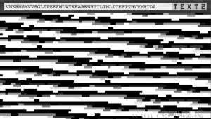
and the meaning behind the art is debatable. The black and white image could be viewed as the challenges faced when trying to understand the complex interactions of the gene and unlocking its role in cancer, while the yellow and green image could be interpreted as the hope in finding a cure that continues to grow as scientists uncover more and more about the gene and its functions, though the black line at the top could represent that there is still pieces that we have yet to discover—the image in not complete. This interpretation could be completely different from another person’s, and one could completely disagree with the interpretation. The point of the art, however, is that it established the means for these kinds of interpretations and stimulates our brains into thinking about the data in this unconventional form. Sharing ideas and perceptions increases the range of what we can learn from data and stimulates intellectual conversations that links scientists, research, and the average person.
These are only a few examples of tools that can be used to generate visualizations of data, yet they demonstrate the main concept that art can be used to represent data in a way that increases the range of understanding that can be subsequently extracted from it. Further, compiling all these data forms into one space, such as a tumblr, allows the reader to experience the images in relation to each other as well as in relation to the scientific articles. A tumblr compilation creates a portfolio of the images—and thus the data—much like how a journal compiles articles of relevance. In addition to reading a journal, one can view the tumblr page and access the data in an augmented manner. Captions and links to the original article accompany the images and visualizations, giving the viewer some background information and hinting towards the artist’s intention in generating the image while leaving the majority of the interpretation up to the viewer. This guidance establishes a basic connection between the data and the art without sacrificing the unlimited perceptions that accompany the visuals. Through a tumblr, viewers can additionally add comments online, thus stimulating conversations about their evaluations of the pieces that could affect the way others experience the medias. This sharing of information and thoughts is derived from the data itself, yet stimulated by the media, thus establishing an alternative connection between science, media, and theory.
7. Neurological Impacts of Pairing Literature with Media
Transforming scientific articles into media visualizations using various tools, such as the ones previously explained and arranged in the tumblr gallery, augments the literature of science. This form of E-literature, generating and augmenting texts through media tools, can change the way a story is experienced and thus increase the understanding that can be obtained from it. The altered presentations of the text allow for us to think in different ways, and such thinking opens doors for new neural connections to be made, thus expanding what can be taken away from the words themselves.
Much like how a graphic novel uses illustrations in place of words to expand meaning and affect the reading experience, visualizations give words a new meaning and that allows us to go beyond the textual context and delve into how the information links to our lives, to other information, and to other elements. For example, Young-Hae Chang Heavy Industries explores the interactions between music and literature, similar to how we have been exploring interactions between visualizations and scientific literature. Young-Hae Chang Heavy Industries pair their jazz pieces with a movie-like stream of words and phrases of varying sizes, speeds, and colors. Though the words do not form complete sentences, they are associated in a way that they flow with the music; rhythmically creating a disjointed stream of consciousness that comes together to tell a story. It is together the display, music, and the words themselves that are telling the story, and thus how the story is unfolds depends on the interpretation of the receiver, and how they associate the visual, sonic, and textual components. Thus, the result will be slightly different for everyone, and may even be different for a single person each time they listen. Similar to Wordle word cloud arrangements, the patterns, colors, sizes, timing, and orientation of how the words appear on the screen in addition to the blinking and changing backgrounds augment the way that the meaning behind the text is associated along with the changing beats and notes of the music. These two artistic components are intertwined to establish an ultimate experience that changes that way we interpret both, interplaying off each other to affect the way each is perceived in relation to the other. Words can invoke feeling just as music can, and that feeling can affect how you interpret the music, or vice versa. This specific kind of experience differs for each person—different things stand out to different people and thus have different significance to different people. Subsequently, each person will have a different interpretation of the piece, and thus the story. These components can even establish a mood, and thus they are not only augmenting the perception of the work itself, but also the environment through which the receiver extracts such interpretations.
Young-Hae Chang Heavy Industries project adds an artistic element to written work that serves to enhance it and provide a mean through which we can expand the boundaries of both music and literature to heighten the potential of both mediums and increase our levels of interaction and interpretation. The music could stand on its own, yet its full impact is not reached until it is paired with the literature; scientific articles can be read on their own, yet adding interactive media expands the reach of data in ways that it can interact with and by perceived by our minds. Literature should not be bound by the confines of print, but rather should reach out to other mediums to build on what the print has given us; to work together to build upon our knowledge and heighten our intellectual stimulation and explore the full potentials of data.
In her novel How We Think: Digital Media and Contemporary Technogensis, N Katherine Hayles claims E-literature representation “allows for criticisms and analysis of programmed media without sacrificing the interpretive strategies evolved with and through print” (Hayles 2012, 25). Thus, in accordance with Hayles’s description, the analysis of science articles through electronic forms of literature helps to enhance the strategies through which we can interpret the data. The brain interprets various media differently, thus the brain can be rewired through exposure to alternative kinds of media. The same data expressed in different forms of media can produce various outputs from the same input. Everyone has different experiences and perception is an embodied experience; as such, as the number of ways content can be experienced increases, the number of subsequent different perceptions that arise from the particular exposures increase as well. This increase in perceptions expands our thinking and widens the boundaries through which information can be extracted from data. Each media has benefits and limitations to what it can portray, yet having multiple media representing a single type of data works to extend the barriers of interpretations. “When humanities scholars turn to digital media, they confront technologies that operate on vastly different time scales, and in significantly different cognitive modes, than human understanding…the meshing of the these two different kinds of complex temporalities does not happen all at one time (or all at one place) but rather evolves as a complex syncopation between conscious and unconscious perceptions for humans…cross-connecting machine processes with human responses” (Hayles 2012, 13). Subsequently, crossing data with visual media links visualization with comprehension, thus increasing the cognitive modes that humans utilize for interpretation of the piece.
8. Conclusion
Augmenting text opens our minds to more cognitive pathways, thus increasing the ways in which we can interpret and share information. Specifically, scientific journal articles are the gateway to discovering cures and transferring scientific data between minds. Our minds augment the data as the information is interpreted, thus by broadening the range of potential perceptions increases the possibility of what can be extracted from the data. As the number of ways we can think increases, the boundary of what we can discover increases as well, removing the confines of text and allowing for our minds to interact together to actively understand the complexities of the world we live in.
Citations
Hayles, N Katherine. How We Think:Digital Media and Contemporary Technogenesis London: University of Chicago Press, 2012. Print.
Iorio, Marilena V, Manuela Ferracin, et al. “MicroRNA Gene Expression Deregulation in Human Breast Cancer”. American Journal of Caner Research 65 (2005): 7065. Web. <http://cancerresaacrjournals.org/content/65/16/7065full
Manovich, Lev (2011) “What is Visualization?”, Visual Studies, 26: 1, 36-49.
“Structural consequences of cancer-causing BRCA1-BRCT missense mutation”. Protein Data Base RCSB .Web <http://www.rcsb.org/pdb/explore/remediatedSequencedo?structureId=1N5O&bionumber=1>
van’t Veer, Laura J , et al. “Gene expression profiling predicts clinical outcome of breast cancer”. Nature. 41531 (2002): n page Web. <http://wwwnaturecom/nature/journal/v415/n6871/pdf/415530apdf>
Yang, Shuan-Ping, San-Tai Song, and Hai-Feng Song. “Advancements of antisense oligonucleotides in treatment of breast cancer” .Acta Pharmacol Sin 244 (2003): n page Web. <http://www.chinaphar.com/1671-4083/24/289htm>
Media Tools
Voyant Tools Word Count Fountain: http://voyeurtoolsorg/tool/WordCountFountain
Text to Image: http://wwwteddavisorg/text2image/
Wordle: http://wwwwordlenet/
Young-Hae Chang Heavy Industries: http://www.yhchang.com/THE_SEA.html
Featured Image: http://informationng.com/wp-content/uploads/2012/12/Wang-cancer-cell-.jpg
