Blown Through the Tube at 50 Miles and Hour – How Woolf’s “The Mark on The Wall” was Revised to Appeal to Modern Readers by Will S.
For this post, I’ll analyze the first printing of Virginia and Leonard Woolf’s Two Stories. The story I’ll focus on, The Mark on the Wall, depicts a narrator who contemplates the decline of tradition and rise of modernity while pondering the titular mark. After much thought and observation on society, the narrator breaks out of thought to realize that the mark was only a snail.
I believe that this printing is framed for readers whose lives were fast-paced and modern. This is apparent in the cover, which is made of a canvas-like fabric instead of leather or a sturdier binding. The cover also features a colorful geometric pattern, which gives the work a light and whimsical appearances. The margins inside the book are very wide, creating a stark contrast between the white space and the text. Together with the relatively wide spacing between lines, this contrast makes the text very easy to read, regardless of one’s location. I believe the ease of handling this text relates to 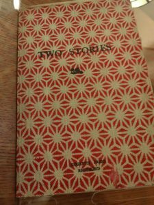 Woolf’s celebration of the decline of static, traditional lifestyles. The line “How shocking, and yet how wonderful it was to discover that these real things, Sunday luncheons, Sunday walks, country houses, and tablecloths were not entirely real” exemplifies this celebration (80). Woolf’s intended readers would realize, through both her writing and their own observations, that traditional, static ways of life were on the decline. And with the onset of these changes, a new lifestyle, one which is mobile and compact, was emerging. Homes with large libraries filled with heavily bound tomes would be no more. In a direct response to this, and in some way as an act of self-reference to the content of the text, Woolf deliberately made the book compact and easy to handle.
Making things convenient for her readers also features in Woolf’s revisions to the text. Many of the corrections Woolf made in the text make the work more comprehensible for  her intended reader. She adds several commas to slow down the text and reinforce the contemplative nature of the text by modifying its structure. This modified structure also helps to change the stream of consciousness narration from long flowing lines into smaller chunks. For example, consider the difference between “ways of speaking about the dead, clothes and habits – like the habit” and “ways of speaking about the dead, clothes, and habits – like the habit…” (80) The former, Woolf’s original, makes the narrator’s voice seem more rambling than the latter’s list carefully separated with commas. I find the latter easier to interpret, and I believe Woolf’s readers at the time would agree. This importantly indicates that Woolf was willing to change the formatting and tone of her work to accommodate her readers.
On the other hand, some of Woolf’s changes heavily change the literal meaning of passages for her intended reader. She made small but noticeable changes to several phrases in the work, such as replacing “hand” with “foot” in the phrase “with the foot of a Chinese murderess.” (81) This change adds a greater sense of mystery to the item it describes. The hand of a Chinese murderess suggests something related to the murder in question, or perhaps some sort of punitive measure. But the foot of a murderess is far more confusing, and Woolf making this change indicates that her goal in these revisions was not simply making the text easier to understand, but making it convey her intended meaning to as many actual readers as possible. In some cases, such as the commas, this meant making sentences more understandable, while in cases like this it meant creating an unambiguous sense of mystery.
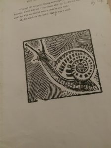
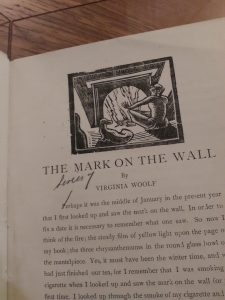
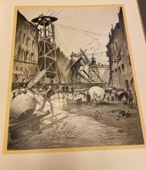
Lastly, the woodcut images in the text help ground the story in a more realist mode. Both The Mark on the Wall and Leonard Woolf’s Three Jewshave black-and-white images depicting figures in common, undignified positions. The figures are depicted using thick, dark strokes which further add to the already somewhat gritty feel of the pictures. Considering the modern and experimental nature of the work and the rest of the work’s framing, this choice of style for the images used in the work is curious. It seems surprising to me that Virginia Woolf didn’t choose a more experimental style of illustration to correspond with the experimental nature of her writing, especially since her and Leonard Woolf were the publishers and presumable had control over the illustrations. Admittedly, the style of the illustrations is close to the way the book is typeset: simple, spaced out, and easily recognizable. But it seems odd that preference was given to matching the typesetting rather than the style of the work. My closing questions on this topic are: “Is the contrast between the style of the images and the style of the text intentional? Would readers of Woolf’s time have seen this as a contrast? Does the juxtaposition of realism with modernism come through in The Mark on the Wall?


Recent Comments