After completing the data pipeline to move MISTRAL data into the storage environment from which it will be made available, we also created a data pipeline to ingest the MISTRAL data into our Splunk environment for (a) security correlations, and (b) creation of data visualizations.
The initial visualizations focus on creating a baseline of the type of traffic we are seeing for our first scientific use-case – that of a science lab designed to capture data from instruments and send that data to storage for further scientific analysis. As such, we expect to see traffic related to storage transfers, DNS lookups and management tools. The first three analyses seem to affirm this expectation.
Count of Destination Ports by Protocols
This visualization (Figure 1) shows the protocol counts (y-axis) by destination port (x-axis). The protocols are ICMP (1), TCP (6), and UDP (17). The scale is logarithmic, due to the high counts of DNS traffic. As expected, we see high counts of DNS (53) and NetBIOS/SMB (138, 445) traffic. The high levels of DNS queries could be occurring if one or more of the machines don’t have caching resolvers installed and are configured to talk to other things by name. This could result in inefficient DNS communications, requiring a lookup for each and every connection.This type of information becomes very useful in:
- Building a baseline of expected ports/protocols in the science environment.
- Pointing unexpected ports and/or traffic levels involved in communications that warrant further investigation.
- Showing potential operational issues to be investigated (e.g. high levels of DNS queries)

Destination Ports Over Time (7 Days)
We took the same data and looked at it over a period of 7 days to get a sense of how the traffic looked over a period of time. One item that stood out was the regular spikes in DNS traffic at ~1 PM each day. This could be completely expected (some update or job running), could be a misconfiguration of some type, or could be something more nefarious such as backchannel communications to upload/exfiltrate data. What is interesting to us is that the MISTRAL infrastructure provided us a conext-specific (e.g. micro) view of a research environment that enabled us to identify this regularly occurring pattern. Our normal enterprise-level security tools would not have identified this recurring pattern, as (a) it would have been “lost in the noise” of the other traffic, and (b) we would not have had visibility into the internal research environment where the activity was occuring.

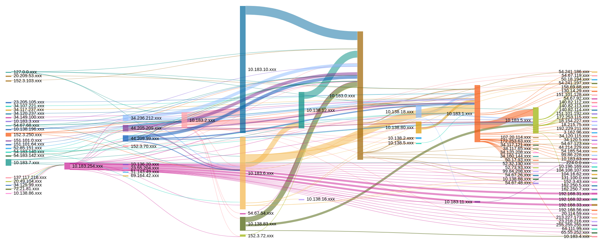
Flow Traffic by Class C Subnets (4 hours)
Our last visualization is a broad look at all network traffic coming into/out of the science environment we are monitoring. This visualization immediately points out where traffic is coming from/going to. While it is a bit detailed, even at this summary level, it does set the ground work for creating additional looks and queries to build further baseline measures by which we can measure future traffic and easily identify anomalies. One item that stood out for us was the traffic claiming to come from 127.0.0.1. This is indeed an anomaly that could either be caused by a misconfiguration or something more malicious. Again, similar to the previous visualization, we may not have quickly identified the issue with the typical enterprise security tools most organizations deploy.