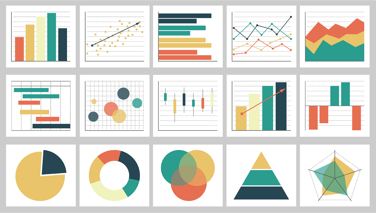
Researchers spend years thinking through questions, planning experiments, and converting ideas into results. When the time comes to communicate those results, sharing data in a way that is clear and meaningful is essential to get colleagues interested in the work. Often, that means creating visual representations of your data, which can effectively convey what words sometimes cannot.
A prominent, open-source language that offers a variety of data visualization tools is R. Here are some useful resources for effective data visualization in R.
Getting Started
R can be intimidating for beginners. Listed here are virtual books and resources for learning R that I have found helpful.
- R for Data Science by Hadley Wickham and Garrett Grolemund: R4DS is an overview of R packages {tidyverse} and {ggplot2}, which offer powerful tools for data analysis and visualization. The book is free, but those wishing to donate can support Kākāpō Recovery.
- {introverse} by Dr. Stephanie Spielman and her lab: This guide is for the absolute R beginner. R documentation can be complex in language and format. To assist novices, this package offers clearer alternate documentation for R and tidyverse functions.
Plotting
Here are a few packages and resources that are useful for sharing biomedical research with R.
- {ggplot2}: When plotting in R, you can use the standard, or “base,” plotting functions, or you can use the highly adaptable {ggplot2} package from Hadley Wickham and company. This package offers highly customizable plots of many types and is compatible with the {tidyverse}, which can format and filter data for each plot. Winston Chang, a {ggplot2} developer, offers this useful “cookbook” for graphics in R.
- {ggprism}: For those who prefer the aesthetics of GraphPad Prism plots but don’t love the cost, {ggprism}, a {ggplot2} extension developed by Charlotte Dawson, offers the clean visualizations of Prism with the flexibility and accessibility of R.
- {plotly}: When sharing data virtually, this package offers interactive plots with the capacity to highlight and communicate data beyond just what is shown on the plot.
Accessibility
Data visualization is most effective when it is accessible to the widest possible audience. Here are resources to make your plots more inclusive.
- Colorblindness-friendly colors: Numerous packages, including {viridis} developed by Simon Garnier and {RColorBrewer} developed by Erich Neuwirth, offer color palettes that are visible to individuals with many varieties of colorblindness.
- Alt text: Using the labs() function in {ggplot2}, it is now possible to add alternate text to R plots to make them more accessible for individuals with visual impairments.
I composed this blog post for the Genetics Society of America Early Career Scientist Weekly Newsletter, published on October 22, 2021. I hope you will find these resources helpful!
Leave a Comment