We will be hosting a conference on gerrymandering from 10am on Monday, March 2nd, until 1pm on Wednesday, March 4th. For details, see the link.
Court Chooses to Stick with Relatively Unresponsive Maps
Today the state court chose to accept the Remedial Map which the legislature produced in response to the maps we have been using since 2016 being declared an illegal gerrymander in Harper v. Lewis.
Sadly this new map still has districts containing an abnormally large number of Democrats and others with comparably few. The result is a map which elects the same number of Democrats and Republicans over an abnormally large range of partisan election outcomes.
My analysis shows that the Remedial Map was much less sensitive to swings in the partisan vote fractions than the vast majority of the maps in the ensemble. The plots below, where the Remedial Plan is labeled HB 1029, show that under a uniform swing analysis the nonpartisan maps in the ensemble often produce 6 and sometimes 7 Democratic seats in election environments when the Democrats perform well (a statewide vote fraction in the low 50%) for many sets of votes, while the 2019 Remedial Map reliably produces 5 Democratic seats in most instances. Each of the different plots uses a different set of historical votes (Labels: USS16- US Senate 2016, AG16 – Attorney General 2016, USH16 – US House 2016, GOV16 – Governor 2016).
The important feature is the atypically large jump between the 6th and 5th most Democratic district. This is the same “signature of gerrymandering” jump which we saw in Common Cause v. Rucho. It makes the maps much less responsive to the votes cast. They produce the same results over a large number of election scenarios.
The fact that the court felt it did not have time to investigate this fully shows how the judicial pathway of preventing gerrymandering is limited. We need legislative reform. It seems the only way to ensure that the maps used in elections are responsive to shifts in the political sentiment of the electorate.
More details can be found in the report I submitted to the court which can be found here: Mattingly Nov. 26 Declaration.
Jonathan Mattingly
Quantifying Gerrymandering in North Carolina – Revisited
We have revised our work quantifying gerrymandering in the N.C. Congressional Districts. The original work was presented in Common Cause v Rucho. We have taken the opportunity to use the improved code base which performs more sophisticated convergence test and update our discussion to better reflect our current perspective. We have also corrected a few inaccuracies and small errors. That being said, the results are fully in line with those from the original version.
The new text can be found HERE.
A collection of related animations can be found “The Animated Firewall.” Two related discussions can be in It’s Not about Proportional Representation and The Fix is in: The votes don’t matter.
The data and code for this work can be found in this git repository: https://git.math.duke.edu/gitlab/gjh/nccongressionalensembles.git.
Expert report and rebuttal from Common Cause v Lewis
This post shares Jonathan’s expert report and rebuttal to the defense’s experts are linked below. The report summarizes some of the research our group has performed on the North Carolina state legislative districts. See this post for complementary animations.
Majority and Supermajority Firewalls in the N.C. General Assembly
[Note: there is a known bug between WordPress and Safari; if the videos below do not render on Safari try switching to a different browser]
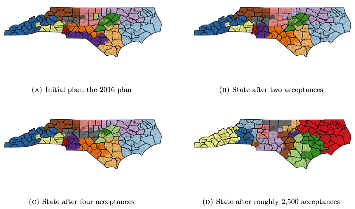
In our analysis of the 2017 North Carolina General Assembly redistricting plan, one of our central findings was that the NC Legislature’s 2017 Redistricting Plan implement a firewall protecting Republican majorities and supermajorities.
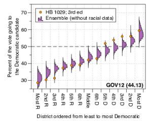
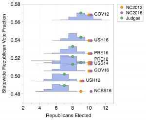
In trial, for the House districts, we showed animated bar-graphs that demonstrated how the range of democratic seat counts shifted with the statewide fraction of Democratic votes, under various shifts to historical elections. For example, under the United States Senate vote in 2016, the enacted plan elects a typical number of democrats when compared to the ensemble when the statewide Democratic vote fraction is below 49%. As the Democratic vote fraction rises to roughly 50.5% to over 52%, nearly all plans in the ensemble break the Republican supermajority, but the enacted plan remains stuck electing fewer than 48 Democrats to the state House. As the Democratic vote fraction continues to rise, the enacted plan consistently elects fewer Democrats than the ensemble; at a Democratic vote fraction of 54.5%, nearly all plans in the ensemble predict a Democratic majority in the House, yet the ensemble retains a Republican majority. The Republicans retain their majority in the enacted plan even when the Democratic vote fraction surpasses 55%; plans in the ensemble yield a strong majority to the democrats at this point.
The story is NOT about proportional representation, rather about how the #ncga 2017 maps (represented by arrow) systematically under-elect Democrats to a shocking degree.
The story is similar when using vote counts from the 2012 presidential race. Notice, in both videos, as the Democratic vote fraction rises to break the Republican supermajority in the ensemble, the enacted plan dramatically remains to the left of the majority/supermajority line.
And as we examine more elections, the story still remains the same. With Commissioner of Insurance votes from 2012, notice how Democrats are systematically under-elected by the #ncga 2017 Redistricting Plan when compared to our ensemble of thousands and thousands of non-partisan maps
Now with 2008 United States Senate votes. Getting worried about our democracy yet? Across many different vote patterns, same exceptionally atypical under-electing of Democrats persists. The effect is very robust across different offices, across different years.
Same story, now using votes from 2012 Governor election. Each election has a different spatial vote pattern, yet story persists. 2017 #ncga map under-elects Dems when they would typically gain more power. Notice map keeps a Republican majority even when some maps give Democrats a supermajority.
Finally, using 2016 Lt. Governor votes. Again same story. The ensemble accounts for natural packing and the voting geography of North Carolina. But natural packing is not enough to explain the enacted plan’s extreme Republican bias. By comparing the enacted plan to the ensemble of non partisan maps, we separate the effects of natural packing from partisan gerrymandering.
Although the above maps will be remedied by the decision of Lewis v. Common Cause, many states are still highly vulnerable to the effects and consequences of partisan gerrymandering with no hope for remedy from the federal courts. Map makers have inserted themselves in the electoral process and suppressed the Will of the People. If you are worried about the state of our democracy, you should be.
Jonathan Mattingly
Gregory Herschlag
Optimal County Clustering in NC
North Carolina’s constitution requires that state legislative districts should not split counties. However, counties must be split to comply with the “one person, one vote” mandate of the U.S. Supreme Court. Given that counties must be split, the North Carolina legislature and courts have provided guidelines that seek to reduce counties split across districts while also complying with the “one person, one vote” criteria. Under these guidelines, the counties are separated into clusters. For a great explainer about the County Clustering problem see this blog entry on Districks.
A group of high school students from the NC School of Science and Mathematics worked with us over the last academic year and summer to develop computer algorithms to optimally cluster counties according to the guidelines set by the court in 2015. We recently released an article that presents the algorithm along with publicly accessible code which anyone can use.
Additionally, in our article, we use this to investigate the optimality and uniqueness of the enacted clusters under the 2017 redistricting process. We verify that the enacted clusters are optimal, but find other optimal choices. We emphasize that the tool we provide lists all possible optimal county clusterings. We also explore the stability of clustering under changing statewide populations and project what the county clusters may look like in the next redistricting cycle beginning in 2020/2021.
The posting to the ArXiv can be found here.
The article is now published and can be found here.
The code is referenced in the ArXiv post, and may also be accessed here.
[Edits: Added like to Districks explainer (9/4/2019)]
The Fix is in: The votes don’t matter
One recurring theme we see is that the results in enacted maps are “baked in.” That is to say that over a wide range of elections changes in the votes do not lead to changes in the partisan make up of the representatives elected. This effect was very pronounced in the N.C. Congressional maps used in 2012 and 2016 . The enacted maps (NC 2012 & NC 2016) produce the same result over a large range of elections. These elections have varying statewide vote fractions; the ensemble shows that the number of elected Democrats change as the elections change, whereas the enacted plans nearly always give the same result.
Here we have shown a number of historical elections and arranged them on the plot from most Democratic to most Republican. We see that as the Republican vote fraction increases the blue histograms show that the typical number of seats elected by our ensemble of 24,000 or so maps shifts towards the Republican direction. The number of Republican seats elected by the Beyond Gerrymandering Judge’s map responds to the shifting public opinion by shifting the number of Republicans elected. The Enacted plans from 2012 and 2016 don’t change over a wide range. In the enacted plan, the loss of support for a party does not result in the loss of seats. In the ensemble and the judges plan, the loss of support for a party causes that party to lose seats.
This effect can be understood in the box-plot graphs of the ordered marginal plots.
The large jump in the plot, which leads to a range of election results for which the partisan outcomes don’t change, was has been referred to as the “Signature of Gerrymandering.”
It’s Not about Proportional Representation
One of the strengths of sampling the space of redistricting plans is that it makes no assumptions about the relationship between the statewide votes cast and the seats won. The collection of plans do not consider proportionality between seats and votes or symmetry in electoral outcomes.
These methods reveal the expected election results under our election system; they assume only the redistricting criteria (usually non-partisan). The sampled maps provide a null hypothesis. Any enacted map can be compared to this null hypothesis to understand the extent of any possible gerrymandering.
The collection of maps, and the expected election outcome they reveal, automatically includes the effect of cities, the distribution of voters and the shape of the region in a simple and principled way. We have looked at North Carolina, Wisconsin and more informally Maryland and Pennsylvania. We have never seen proportionality between the votes and typical seats given by an ensemble.
For example, consider the election of the US House of representatives for North Carolina and the election of the General Assembly of delegates for Wisconsin. In the first, we compare the 2012 enacted plan against the ensemble using the 2012 Congressional votes; in the second, we compare the 2011 enacted Wisconsin plan against the ensemble using the 2014 General Assembly votes.
NC House 2012
Vote | Seats | |
---|---|---|
Democratic | 50.65% | 4 (31%) |
Republican | 48.80% | 9 (69%) |
Wisconsin 2014
Votes | Seats | |
---|---|---|
Democratic | 51.28% | 36 (36%) |
Republican | 48.72% | 63 (64%) |
Clearly neither seat outcome of the enacted plan would be call proportional representation. However, the large ensemble of non-partisan maps reveals that the results in Wisconsin are, in fact, typical for this set of votes whereas the North Carolina outcome is not.
Although the WI enacted plan is representative for this particular set of votes, when the Democratic vote fraction drops below 50%, the enacted plan acts as an extreme outlier producing highly atypical results. (This effect is well understood: See Firewall and The Signature of Gerrymandering.) This effect is shown below.

Notice that the trend shown by the ensemble histograms in blue do not follow the vote-seat proportionality line marked on the plot. However the Enacted map is still shown to be an outlier as the vote fraction drops below 50%. It shows a “baked in” result which is do not move as the people’s will expressed in their votes changes.
This “baked in” election outcome is even more pronounced in N.C. where the enacted maps (NC 2012 & NC 2016) produce the same result over a large range of elections. These elections have varying statewide vote fractions; the ensemble shows that the number of elected Democrats change as the elections change, whereas the enacted plans nearly always give the same result.

Again the proportionally line on the plot does not track the shift in the blue histograms produced by the ensembles as the election used varies. The ensemble reveals the natural baseline without assuming proportionality.
Jonathan Mattingly
Gregory Herschlag
The Animated Firewall
When discussing gerrymandering, there is an intuitive drive to discuss how many seats were won by a given party, and how egregious this result may be. The measure of egregiousness may come from an assumed ideal of proportionality or symmetry, or may come from a comparison with an ensemble of alternative plans.
But as we have shown, the number of elected party officials in a gerrymandered plan may be entirely typical of the ensemble; it may, for example, only be when a party is in danger of losing the majority of seats that a plan becomes a typical. In this previous post, we have made efforts to visualize how changes in the Democratic or Republican statewide vote fraction change the number of elected Democrats and Republicans in both the ensemble and an enacted plan. In this post, we create an animation of this effect.
In North Carolina, state house Republican Representative David R. Lewis famously stated that the 2016 North Carolina congressional maps were drawn “to give a partisan advantage to 10 Republicans and three Democrats because I do not believe it’s possible to draw a map with 11 Republicans and two Democrats.” We ask how robust this effect is by considering the 2016 United States Congressional voting data in North Carolina and then using the uniform swing hypothesis to vary the statewide Democratic vote percentage from 42.5% to 57.5%. We render an animation that demonstrates how the number of elected Democrats changes in the ensemble and the 2016 enacted plan with respect to the statewide Democratic vote fraction.
When the statewide Democratic vote is between 42.5% and 52.25%, the enacted plan consistently elects 3 of 13 Democrats. From 47% to 53.25%, the enacted plan is an extreme outlier with respect to the ensemble. Even as the Democrats pick up a fourth seat in the enacted plan at 52.37%, nearly all plans in the ensemble elect 5 or more Democrats. In short, under this election structure and swing assumptions, the Democrats would need nearly 53% of the statewide vote in order to gain a number of seats that are even some what typical of the ensemble of plans.
We repeat this animation in the Wisconsin general assembly, examining the 2012 United States Senate vote in Wisconsin and using the uniform swing hypothesis to vary the Democratic statewide vote percentage from 44% to 56%.
The firewall is now animated: Again, when the statewide Democratic vote is less than 50%, the enacted plan and the ensemble lead to a Republican majority and the enacted plan is typical of the ensemble; the statewide Democratic vote rises to 51% , the enacted plan becomes atypical of the ensemble, however both the ensemble and the enacted plan still yield a Republican majority; as the Democratic vote fraction continues to increase, the enacted plan becomes more atypical yielding far fewer Democrats than is expected by the ensemble. In a large range the ensemble predicts the that the Democrats should expect to receive a majority, however they do not under the enacted plan; at the higher end, the Democrats begin to expect a supermajority from the ensemble, but they do not achieve this in the enacted plan.
Gregory Herschlag
Jonathan Mattingly
Localized view of Quantifying Gerrymandering
This post continues the theme of localized analysis begun in the post Towards a Localized Analysis. The analysis presented in our articles and blog post such as The Signature of Gerrymandering , Firewalls, and Hearing the Will of the People are largely based on a global, statewide analyses. In many ways, Gerrymandering is a global phenomenon as one can not change one district with out effecting its neighbors which often causes a cascade of changes across a state. Packing a particular group in one district is done to dilute the groups effect in other districts.
The most basic measure of a districting plan’s character is the partisan make up of its elected representatives. When comparing a plan’s partisan make up with a set of comparison maps, we obtain a view that is fundamentally global in measuring gerrymandering. Marginal box-plots can be used to identify particular districts as unusual. This is a step towards a more localized analysis. As described in The Signature of Gerrymandering post the marginal box-plots of the ranked vote curve were used to identify specific districts, in the legislatures 2016 maps, which were arguably cracked and packed in court case Common Cause v. Rucho concerning the 2016 NC Congressional maps.
In the Marginal box-plots, a particular set of votes is used to order the districts from most to least Republican in the ensemble of districting plans; to examine a particular district in a given plan, we first consider the district’s rank in the order (from most to least Republican) and then compare that district’s partisan make up with the partisan make up of the districts in other plans with the same rank in the order. Such analysis examines deviations in the the overall statewide structure of votes along with with where this deviation may occur, but it does not geographically constrain the districts with which to compare the district of interest.
We wish, however, to perform a more geographically localized analysis. Such analysis still contains the fundamental framework of examining outliers within the context of an ensemble of nonpartisan maps. (Outlier analysis using an ensemble of maps is generally discussed here. The basic idea of the localized analysis was previously presenter here.)
The Typical Local Political Environment of a Precinct
Localized analysis begins by choosing a particular precinct of interest and collecting the districts containing this precinct from an ensemble of state wide maps. The resulting collection of districts, all which contain the precinct of interest, can then be used to characterize the typical district-level political environment that voters in this precinct could expect to experience.
By contextualizing a precinct within the collection of districts containing it, we may relate the partisan preferences of the precinct’s voters to the preferences of their typical district. For example, a precinct’s voters may prefer one party, but typically find themselves in a district that votes for the opposing party; in this sense we may determine whether or not it is natural for the typical voter within a given precinct to be able to elect a candidate associated with the party they have voted for.
We contextualize the typical district containing a precinct by constructing a histogram over the ensemble of districts (this process was described in detail the previous post Towards a Local Analysis.) This distribution can then be used to deicide if the district containing the precinct in a given plan is atypical. If a precinct does find itself in an atypical district, then its residents may have cause to object. In this way, the ensemble of districts can be used in a normative way to identify outliers.
Extreme Outliers in the NC Congressional Races
Similarly to our previous blog post (Towards a Local Analysis) we again apply the above analysis the North Carolina Congressional Map from the 2016 and 2012 elections which we will abbreviate respectively NC2106 and NC2012. We will also consider the map produce by the retired judges from Beyond Gerrymandering Project lead by Tom Ross. This map will be denoted “Judges”. Previously we used a 5% outlier condition which many may classify as rare, but is more arguably extreme. We adapt the current analysis to examine more extreme outliers (those that occur less than 1% of the time, rather than 5%).
We begin by analyzing each precinct to determine if the district counting the precinct in the map of interest has an unusual partisan make up from that precincts perspective. Precincts which find themselves in a district whose partizan make up is in the in tails corresponding less than 1% of probability are labeled as extreme (at p=99%)
In the table below, we show the number of precincts which are extreme outliers from 2,692 predicts in different NC Congressional maps for the using the 2012 and 2016 US Congressional elections, denoted by USH12 and USH16 respectively. For comparison purposes, we then tabulate the number of maps in our ensemble which have that many or more precincts which are extreme outliers.
Map | 2012 Votes | 2016 Votes | ||
---|---|---|---|---|
# Outliers | # in ensemble w/ more outliers | # Outliers | # in ensemble w/ more outliers |
|
NC2012 | 796 | 0 (0%) | 655 | 0 (0%) |
NC2016 | 154 | 336 (1.4%) | 233 | 76 (0.31%) |
Judges | 2 | 15022 (61%) | 3 | 13448 (55%) |
The histograms below give the full histograms of the number of maps with different numbers of outlier precincts using the two sets of election data mentioned above.

The spatial location of each of the outlier districts is show on the following maps. The first three us the US12 election data
The second three use the USH16 election data.
Precinct by Precinct Log Likelihood
Instead of just using the using the precinct localized distribution constructed above to flag districts individual as outliers, one can calculate the likelihood of partizan vote fraction being as far or farther in the tail then that each precinct in a given map. Averaging this across the state gives a measure of how typical the precinct by precinct are across the whole map. To contextualize this average spatial log likelihood calculate the value for each map in our ensemble. The following two histograms summarize the results.
Again to show the spatial structure better, we plot the log likelihood across the state, precinct by precinct. So that the direction of the swing is visible, we label democratic with positive values and republican with negative.
The above maps use USH12 election results while the maps below use UH16 election results.