Text Visualization: see more than texts
Author: Xin Zhang
-
Introduction:
In the coming of the digital age, study of data becomes more and more important when dealing with a huge amount of information. For example, there are more than 155.3 million items in the Library of Congress [1] which would take about 500 hundred years for one to read 10 items each day. Human brains are not good at studying such a huge amount of information while machines with great computational power are good at handling big data by doing repetitive works fast. According to Moore’s Law, “the number of transistors in integrated circuits doubles approximately every two years” (See Fig. 1.), which means that the computational power of machines grows faster and faster. It is a trend to study a huge amount of information by converting it to data and then analyzing it by use of the computational power of machines.
![Fig.1. CPU transistor counts v. s. date of introduction.[2]](http://sites.duke.edu/lit80s_02_f2013_augrealities/files/2013/12/1-moore-law.png)
As for using machines to study of texts, a new research field named text mining, which is in contrast with data mining of computer science has emerged. Text mining tries to find statistical patterns through analyzing of a corpus which contains a huge amount of texts that is readable to machines. By the text mining process, some underlying patterns of a big data system can be uncovered. Text visualization is one of the most important tools for text mining due to its readability to both human and machines. Text visualization is mainly achieved through the use of graph, chart, word cloud, map, network, timeline, etc. It is these visualized results that make it possible for humans to read the most important aspects of a huge amount of information. In this paper, I make a review about the several typical text visualization tools and projects. Then I present my own project named “dynamic word cloud” which uses TF-IDF instead of word frequency as a weighting factor in order to highlight key words better. Finally, I make a summary about text visualization and its effects on literature study.
-
Text Visualization Review
-
Graph
-

As for the use of graphs to do text visualization, the most successful example is Google Ngram Viewer [3]. Google Ngram Viewer is a phase-usage graphing tool based on phase-usage frequency in the materials published in different years. This tool is supported by a database which contains over 5 million books digitized by Google Inc [4]. When the user types in several words or phrases, the tool will search the database to find matches and generate a graph to show the relation between frequency and published year as shown in Fig. 2. With a graph like this, it is easy for researchers to know the development of phrases and also the relationship between phrases. The developments of phases may in some aspects show the development of culture and society.
To see the development of astronomy, I use Moon, Mars, Mercury, Venus, Jupiter, Saturn, Uranus and Neptune as keywords in Google Ngram Viewer to generate a graph to show the development of these words.
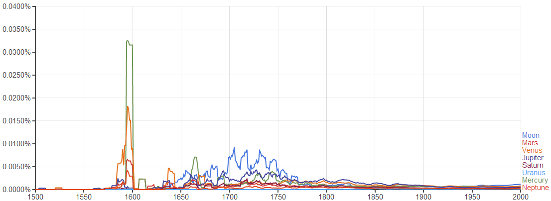
The result is interesting. It seems that in the 14th, 15th and 16th centuries people pay more attention on astronomy. The special time is the time period around 1600 when astronomers used evidence from the observations of planets’ orbits to show that earth revolves around the sun. This shows that the Google Ngram can be used as a tool to do text archeology.
-
Chart
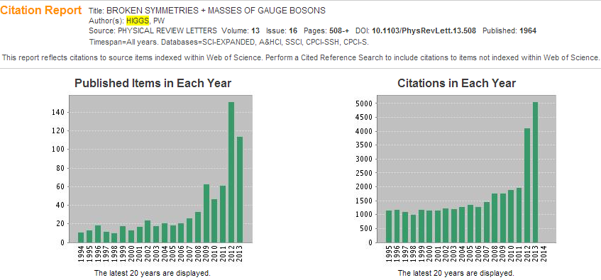
It is a very common method to do data visualization by using of charts in reports, scientific papers, blogs etc. because it is easy to be produce. There are several different kinds of charts such as the pie chart, bar chart, bubble chart and scattering chart for different uses. Here I want to show the text visualization tool used in the citation report of Web of Science. It is always a headache for scientists to read and analyze thousands of papers to know the development of a specific research field. In the citation report of Web of Science, the system collects data about papers’ citations and then generates a chart to show how the citations of one paper distributed over time. From this trend of citation, scientists can know the development of a research field easily. Although the visualized elements here are not words or phrases but papers, I still think this is generally speaking text visualization because it uses the citations of all the texts in one paper just like other text visualization tools use usage frequency of words. To illustrate the idea of this visualization tool, I generate a citation report of Peter W. Higgs’s famous paper BROKEN SYMMETRIES + MASSES OF GAUGE BOSONS with Web of Science as shown in Fig. 4. It is obvious for the reader to know that the citation of Higgs’s original paper about the origin of mass increased very fast in the last five years while the citation kept low before 2008. This shows that Higgs’s theory was not popular in the old times. His theory got so popular these years that he won the Nobel Prize.
-
Word Cloud

Fig. 5. Word Cloud of all my weekly blogs generated by Wordle

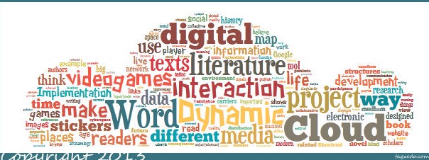
Word Cloud may be the most beautiful, creative and powerful tool for text visualization. By making words stand out either by means of font size or color according to their usage frequency, Word Cloud has its significance in both text analysis and digital humanities scholarship. Text analysis result in the form of a word cloud can show the theme of texts obviously if the presumption that more important words appear more often is taken to be true. In order to show the power of word cloud, I made a word cloud of all my weekly blogs by using Wordle [5] as shown in Fig. 5. It is easy for the reader to know what I have written this semester without reading my blogs. The several most important words are “literature”, “project”, “media”, “texts” and “data”. It seems that I did not digress from the subject this semester. Besides being a tool for text visualization, a word cloud can also be used as an art piece due to its beautiful form. Tagxedo [5] is a tool to do word cloud artistically. In this tool, the user can design the shape of word cloud, the front of words and the contrast of words. I do a word cloud of my weekly blogs using Tagxedo and get a beautiful word cloud as shown in Fig. 6. This is an art piece with both aesthetic character and literary elements.

-
Map
Maps have always been an important tool for geoscience. For literature study, it is a new idea. With the development of text mining, scholars begin to use tools of other disciplines to find things that have been neglected before for example the spatial features of literature. As far as I know, there are mainly two different kinds of maps in text visualization: geographic map and abstract map. For geographic maps, the basic idea is to put literature in the corresponding geographical environment to find some relations or interactions between texts and environment. An excellent project using a geographic map for literature analysis and text visualization is the Maps of Early Modern London [6]. In this project, the researchers put the sites that are mentioned in literature pieces about early modern London onto an old map according to descriptions in these literature pieces in order to find some relations between geographic features and literature. For abstract maps, the idea is to show the spatial distributions of texts. An example of this kind of map is the heat map used in Juxta [7].
![Fig. 7. A heat map of the rough draft and final draft of the Declaration of Independence from Juxta [8]](http://sites.duke.edu/lit80s_02_f2013_augrealities/files/2013/12/7-heat-map.png)
Heat map is a concept used in physical science to show the spatial features of temperature distribution. A heat map here is used to show how one kind of texts distributed over a literature piece. Fig. 7 is a heat map of the rough draft and the final version of the Declaration of Independence from Juxta. This heat map highlights the texts that were different between the rough draft and the final version. By this map, the reader can easily find out which part of the Declaration of Independence was discussed frequently at that time based on the distribution of different texts between the rough draft and the final version. This can also urge the reader to think why the texts are different and to find the hidden meaning behind these different texts.
-
Network

A Network is used to show the relations between different units that make up the whole network. Text visualization based on network mainly aims at making a network of different parts of literature and trying to find relations between different parts and structures of literature. One important form of the network is tree structure which pays more attention to the relations between leading parts and subparts. A brilliant work done by Stefanie Posavec is to visualize texts using tree structure. Fig. 7 shows the structure of Part One of On the Road by tree structure. From this the reader can find the core idea at the first glance. Following the structures of the tree, the reader can easily get to know how one part relates to the other part even without reading the texts. And also when reading the texts, the reader may not have a clear structure of the whole texts. But with this kind of visualization, some hidden aspects about the structure of texts emerge which may help the reader to understand the texts better.
-
Timeline
Timelines are very commonly used tool for data visualization. While for text visualization, some effects that go beyond the concept of visualization may emerge. In contrast to a map which are used to show the spatial features of texts, timelines is used to show the temporal aspects of texts. When a timeline is used in text visualization, the result will be more like an electronic literature. One example is the project the Knotted Line [10]. In this project the author makes an interactive timeline to show the whole story. By clicking the dots along the timeline, the reader can uncover the plots of the story. And its graphical and dynamical interface makes the project have interaction with the reader. This project tells a story based on a timeline instead of solely words. This makes the reader think more about temporal aspects of the whole story which cannot be achieved easily in traditional literature.
-
My Program: Dynamic Word Cloud
The Word Clouds mentioned before focus on the static features of texts. That means that those clouds show the features of the whole texts without change over the process of reading. But that is not the case for our reading process. While we are reading, the clouds will change because some words will be forgotten as time goes on. And also different parts of texts always focus on different ideas. That means that there should be some local features of every part that cannot be shown in one word cloud of the whole texts. So what I want to do is a dynamic word cloud that considers the memory of human and the local features of texts. There are mainly three most important ideas in the text visualization of my dynamic word cloud:
-
Using TF-IDF [11] as weighting factor considering the local features
Instead of using usage frequency as the weighting factor to show importance of words, I use TF-IDF as the weighting factor. TF-IDF is a factor used in data mining that can stress out the words that are frequently used in subparts but not frequently in the whole texts. So using TF-IDF factor as the weighting factor makes a word cloud of a subpart have more local features. The local features can help the reader know the main idea of one part of the texts clearly.
-
Considering the memory of human
In order to consider the memory of human, I set the lifetime of word according to TF-IDF factor. As the words with larger TF-IDF are more important, I set a longer lifetime for them to exist on the dynamic cloud. At the same time, new words appear on the dynamic cloud with a constant speed which simulates the reading process.
-
Making significant words with larger hue
In order to make the important words more impressive, I make important words have large hue values which distinguish them in terms of color.
I use my program to process Darwin’s on the Origin of Species. My program is written in Mathematica. You can try it here. The result is shown as below:
-
Conclusion:
From the above review of text visualization tools and description of my own text visualization program, it is easy to see that text visualization a tool and also a method based on the computational ability of machines to study huge amount of data of texts in order to find some hidden patterns under texts. No matter in what form text visualization appears, the core thing is the text analysis process behind the visualized results because the visualized results act a graphical media for the reader to read machine’s research results which are written in 1s and 0s. But I am not denying the importance of the form of text visualization. Different forms always generate different digital humanities and different artistic effects as shown before. With the further development of machinic computational ability, more modern technologies and tools like text visualization should be developed for literature study in the digital age.
CITATION:
[1] “Fascinating Facts.” About the Library (Library of Congress). N.p., n.d. Web. 06 Dec. 2013. <http://www.loc.gov/about/facts.html>.
[2] “Moore’s Law.” Wikipedia. Wikimedia Foundation, 12 June 2013. Web. 07 Dec. 2013. <http://en.wikipedia.org/wiki/Moore’s_law>.
[3]Google Ngram Viewer. Google Ngram Viewer. N.p., n.d. Web. 08 Dec. 2013. <https://books.google.com/ngrams>.
[4] Whitney, Lance. “Google’s Ngram Viewer: A Time Machine for Wordplay.” CNET News. CBS Interactive, 17 Dec. 2010. Web. 08 Dec. 2013. <http://news.cnet.com/8301-1023_3-20025979-93.html>.
[5] Wordle – Beautiful Word Clouds. Wordle – Beautiful Word Clouds. N.p., n.d. Web. 05 Dec. 2013. <http://www.wordle.net/>.
[6] Tagxedo. Tagxedo. N.p., n.d. Web. 08 Dec. 2013. <http://www.tagxedo.com/>.
[6] MoEML. : The Map of Early Modern London. N.p., n.d. Web. 08 Dec. 2013. <http://mapoflondon.uvic.ca/>.
[7] Juxta. Juxta. N.p., n.d. Web. 08 Dec. 2013. <http://www.juxtasoftware.org/>
[8]Juxta Commons Shared Visualization. Juxta Commons. N.p., n.d. Web. 08 Dec. 2013. <http://juxtacommons.org/shares/yY6Wrj/sidebyside?docs=46,47>
[9] Literary Organism : Stefanie Posavec. Literary Organism : Stefanie Posavec. N.p., n.d. Web. 08 Dec. 2013. <http://www.itsbeenreal.co.uk/index.php?/wwwords/literary-organism/>.
[10] KnottedLine. Knottedline. N.p., n.d. Web. 08 Dec. 2013. <http://knottedline.com/tkl.html>.
[11] “Tf–idf.” Wikipedia. Wikimedia Foundation, 12 Mar. 2013. Web. 08 Dec. 2013. <http://en.wikipedia.org/wiki/Tf–idf>.